Impact of COVID-19 on major stock markets
Projects | | Links:

Introduction
Objective
According to Nicola et al. (2020), the impact of covid-19 has gone far beyond health considerations to a number of other factors, including the stock market being correlated with lockdowns, which subsequently results in covid-19’s impact on financial markets. In this report, the purpose is to examine three major stock markets: The FTSE 100 (The Financial Times Stock Exchange 100 Index) of the United Kingdom, The NYSE (New York Stock Exchange) of the United States of America, and NIFTY 50 (National Stock Exchange Fifty) of India, in order to see any trends which were there between stock prices and covid factors in the events happened during the past two years and also to forecast how changes to covid-19 factors may affect these markets.
Background and literature review
Since the outbreak of COVID-19, people’s lifestyle has drastically changed in terms of work from home, to online retail store and remote learning as some of the methods of dealing with this crisis. In light of this, each country has experienced some impact in their economies. These countries can be from either emerging or developed markets.
In research from Singh and Shaik (2021), almost every industry was impacted by covid-19 in some way. In particular, the airline and hotel industries showed very low CAR (cumulative abnormal returns) during lockdown periods, which could be attributed to the fluctuations of stock prices within these industries (Singh & Shaik, 2021). Hence, the adverse effect of such unfortunate events on the financial market must be studied to prevent future risks and in order to lessen the impact of such unfortunate events on the world’s economy in the long run (Chahuán-Jiménez et al., 2021).
According to AAAM et al. (2020), some investors from emerging markets like India panicked in the run up to lockdowns, which resulted in low average abnormal returns (AAR) for the year. Additionally, factors such as the number of verified new cases and deaths per day associated with COVID-19 can be considered in evaluating the effect of the contagion on the stock market returns (Al-Awadhi et al., 2020).
This report focuses mainly on predicting the change percentage per day in the closing price of the three markets mentioned at the beginning. The analysis starts with the correlations and is followed by the forecast for the percent change per day. This is done by creating models for each market by using random forest regression and checking the model’s accuracy by performing a final accuracy check on the model.
Methodology
We will be drawing upon the data discovery process from Jones (2014) for the purpose of this report.
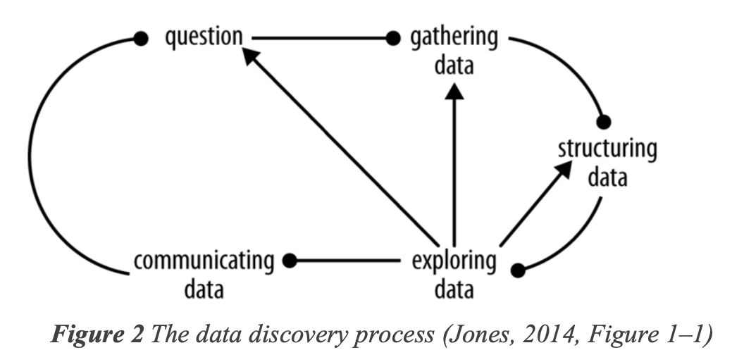
This study uses random forest algorithm to create predictive models for the mentioned three markets. Here, the dependent variable is “change percentage” (change in closing price per day) and the independent variables are: total deaths, total cases, low, high, open, close, total vaccinations, new tests, positive rate, date etc. The reason for using random forest regression here is due to its robustness towards outliers (outliers shown in Figure 2.3.b) relative to multiple linear regression (Ouedraogo et al., 2018). Moreover, random forest regression has a nonparametric nature and the data here was not normal (shapiro test for dependent variable i.e. change percentage of NIFTY, FTSE and NYSE was found to be < 0.05) (Ouedraogo et al., 2018).
Gathering data
The datasets consists of collection of Covid-19 data by Our World in Data, historical stock index data by the wall street journal for FTSE, NYSE and NIFTY. The source URLs for each dataset are given in table 2.1.a. The covid-19 dataset has a total of 67 columns (at the time of this report) which consists of several health related data-points like total confirmed cases, deaths, tests taken, date (format: YYYY-mm-dd), country name etc. These factors will help in determining the correlation with the historical stock data. All the datasets were read using read_csv function from the tidyverse package.
| Dataset | Provider | URL |
|---|---|---|
| Covid-19 dataset | Our World in Data | https://github.com/owid/covid-19-data/tree/master/public/data |
| FTSE historical dataset | The Wall Street Journal | https://www.wsj.com/market-data/quotes/index/UK/FTSE%20UK/UKX/historical-prices |
| NYSE historical dataset | The Wall Street Journal | https://www.wsj.com/market-data/quotes/index/NYA/historical-prices |
| NIFTY 50 historical dataset | The Wall Street Journal | https://www.wsj.com/market-data/quotes/index/IN/NIFTY50/historical-prices |
Table 2.1.b shows the columns and their data types in historical stocks dataset. This data is consistently recorded from 1st January 2020 to 3rd January 2022 for all three mentioned markets.
Table 2.1.b. Data types for columns of stock dataset
| Column Name | Data type | Data type in R |
|---|---|---|
| Date | Ordinal | date (format: mm/dd/yy) |
| Open | Interval | double |
| High | Interval | double |
| Low | Interval | double |
| Close | Interval | double |
Structuring data
The datasets mentioned above must be structured and merged into one master dataset prior to exploratory data analysis. Whenever working with multiple datasets where it is intended to merge them into one master dataset, it is imperative that the columns are uniform i.e. that the data is arranged uniformly (Azeroual, 2020).
Structural errors
For all the stock datasets and covid dataset, date format are made uniform to “YYYY-MM-DD”, R’s as.Date() & format() methods are used here to make all the date columns uniform. Secondly, we add three new columns in all three stock datasets namely: iso_code, exchange_name and change_percentage. Here, iso_code is added to make it a common parameter to the covid dataset, exchange_name is added to label market names in the dataset and finally change_percentage is a dynamic column which is calculated by the formula given below by using tidyverse’s mutate() method.
Missing values
Missing values were handled differently depending on the proportion of missing values that were present (Lin & Tsai, 2019). Figure 2.2.b shows the proportion of missing values in the dataset. In cases where less than 5% of a column’s values were missing, the rows were dropped using tidyverse’s drop_na () method. For columns like number of deaths and deaths per million, the values were imputed by 0 since deaths started only after march for all three countries used in this report. Whereas, for the rest of the columns imputation was performed using PMM and bootstrap with help of Hmisc (Harrell Miscellaneous) package in R (Akmam et al., 2019). The average r-square value for imputation was approximately 0.9 to show the accuracy in predicting the missing values, higher the r-square value the better (Ghazali et al., 2021).
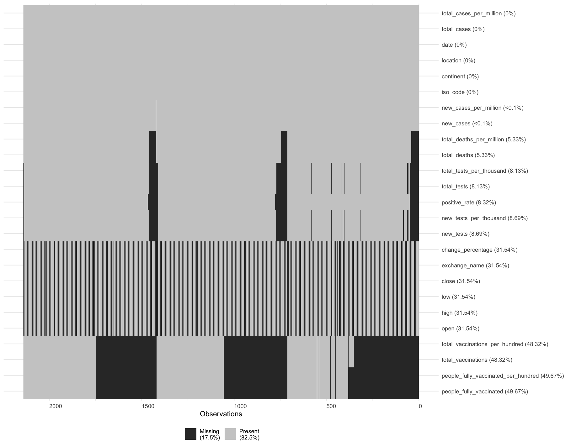
Figure 2.2.b missing values visualisation
Normalization
Given that both independent and dependent variables are numerical in nature, an analysis was done using boxplots. In general, reading these plots would require comparing the location, dispersion, skewness, as well as the likely outliers (University, The Open, 2016). It appears in figure 2.3.b that there are a great deal of independent variables with outliers and skewness. Firstly, when it comes to location, for instance, the total number of cases and deaths exceeds that of the closing price for FTSE in the United Kingdom. We also see this pattern for total tests and people vaccinated. Secondly, in terms of dispersion, interquartile ranges for total deaths, cases and closing prices are relatively similar, despite the fact that the overall scale is greater for total cases and deaths. Thirdly, in terms of skewness, most of the columns seem to be positively skewed (skewed to the right) across all three countries. For instance, the sample skewness for positive rate was 1.74 for NIFTY, 2.79 for FTSE and 1.61 for NYSE respectively.
Figure 2.3.a Logarithmic transformation formula
For the variables with skewed distributions such as the ones described above, several transformations can be carried out like the logarithmic, square root, or reciprocal transformation in order to reduce the effects of high values and try to get closer to normality (Lee, 2020). For this study, a logarithmic transformation was undertaken using the formula shown in figure 2.3.a. Here, “(1 – min(x))” is added as a constant to handle both positive and negative values as mentioned in Lee (2020). In this case, the logarithmic transformation result was assigned by using the “:=” operator from data.table package in conjunction with the mutate() method from dplyr package.
Filtering data for analysis
Considering that the objective of this study is to develop three distinct models of prediction, the master dataset was filtered and separated into separate training and test datasets for each stock market, which for the models to be accurate is vital (Pawluszek-Filipiak & Borkowski, 2020). For the purposes of this study, the proportion of training and test datasets were set at 80 and 20 percent respectively. This was done with the help of basic indexing of a data frame (Cotton, 2013, Chapter 5) and sample() method from base R.
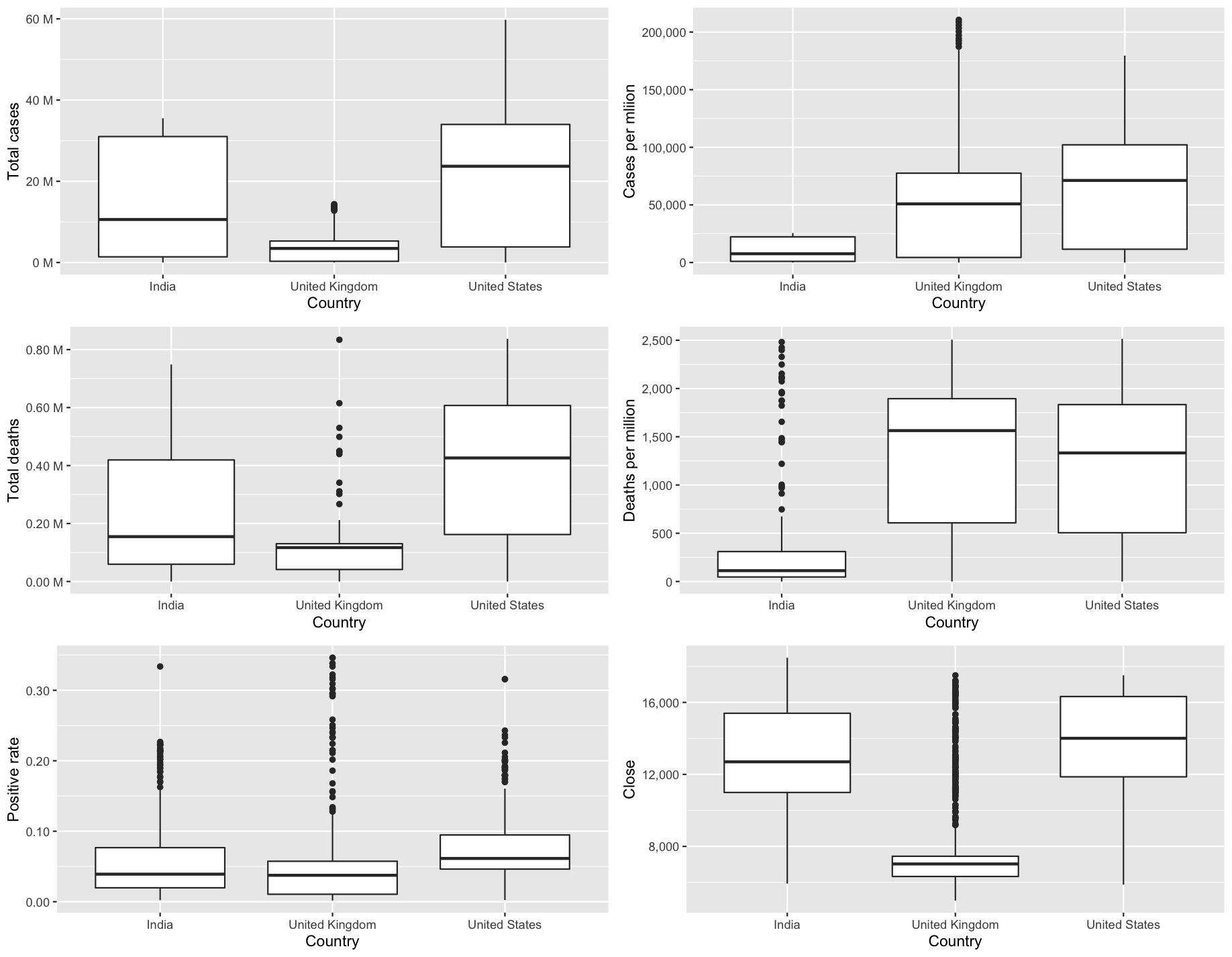
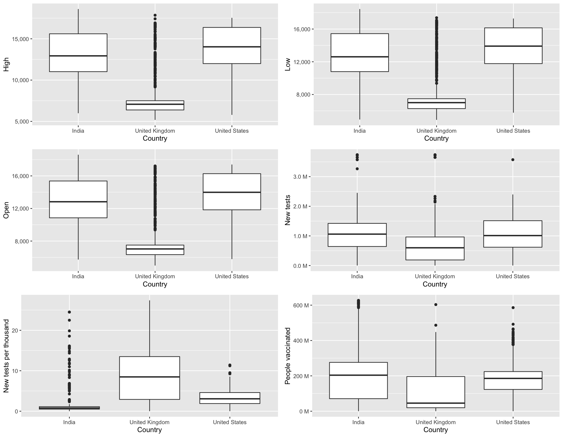
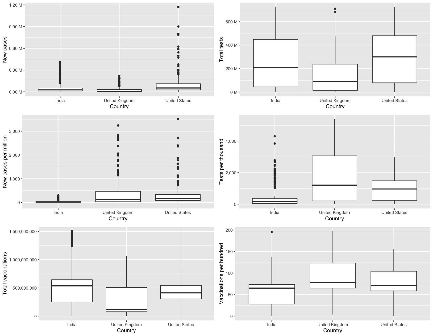
Figure 2.3.b Boxplot of independent variables
Results and discussion
Data exploration
How much were countries effected by covid-19?
As a starting point, let’s take a look at figure 3.1.1.a, which illustrates the global impact of the covid-19 with four factors, the number of confirmed cases, deaths, tests taken, and vaccinations administered, and locate the top ten countries affected by this crisis. With respect to the factors shown in figure 3.1.1.a, the United States, India, and the United Kingdom were affected in almost every case, with the United Kingdom having the least impact in terms of raw numbers.
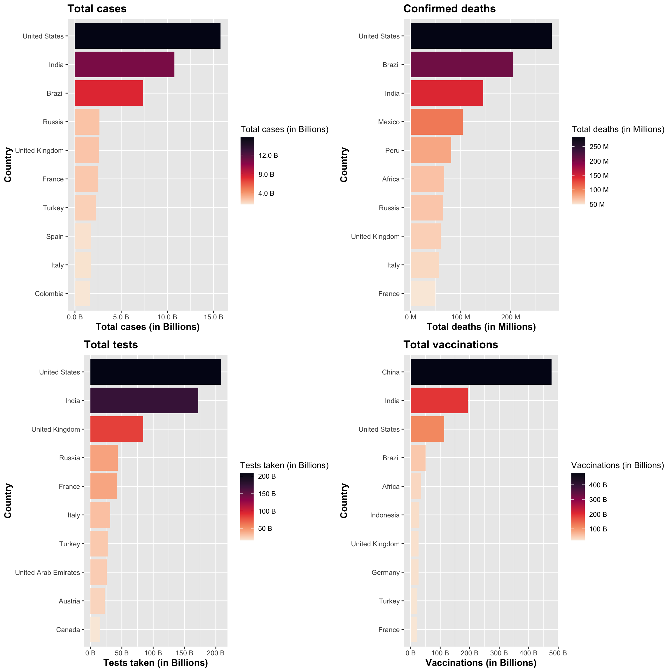
Figure 3.1.1.a. Top 10 countries affected by Covid-19
Now let’s see total number of cases that were compared from Jan 2020 to Jan 2022 between the United Kingdom, India and United States as shown in Figure 3.1.1.b. According to the OWID dataset, United States had the most highest cases for the given time period. A direct correlation can be found from the line chart in Figure 3.1.1.b between the total number of cases and the lockdowns imposed on these countries. If we look at the United Kingdom for example, starting the lockdown in March 2021 and staying until at least May 2021, before launching the exit strategy (Iacobucci, 2020); we can see the cases dropping and becoming stable during this time before increasing after June 2021. Similarly for India, there was a nationwide lockdown starting around March 2020 (Gettleman & Schultz, 2020), and again we see that cases can be relatively steady around March 2020, and start to rise after June 2020 when the lockdown was lifted.
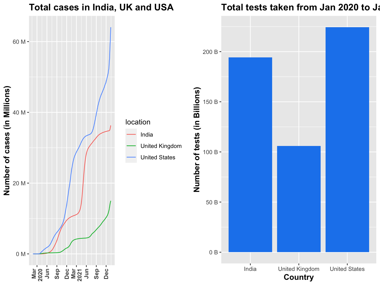
Figure 3.1.1.b Total cases and tests visualisation
When compared with number of tests taken, a similar pattern was seen with United States having most tests taken between these three countries for the given time period (Figure 3.1.1.b).
Next, we will discuss the comparison of total number of cases and deaths per million, as shown in Figure 3.1.1.c. As compared to the other two countries, up until now the United Kingdom was ranked last both in terms of cases and deaths, but it is apparent now that this is not the case. In this way, when compared with the raw numbers (totals cases, deaths) as a per million factor, it can be seen that death rates in the United Kingdom have increased more rapidly as the number of cases increased. Meanwhile, the United States performed in a similar manner to the United Kingdom. As for India, it is reflected in this chart as a linear relationship between cases and deaths, with a small bubble considering the large population compared to two other countries.
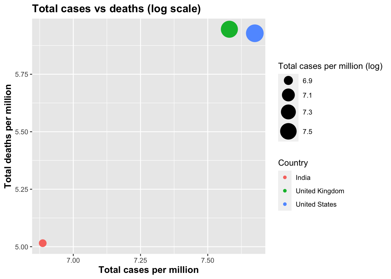
Figure 3.1.1.c Comparing total cases vs deaths
How did stock markets perform during this time?
Across all stock markets, reaction to covid-19 has been affected by several factors, including the GDP of each country, lockdown restrictions and most importantly, the reaction of the public towards this pandemic. Once again, we will examine the example of India. As discussed earlier, the lockdown was imposed by the Prime Minister Narendra Modi in March 2020 (Gettleman & Schultz, 2020). Clearly, we can directly correlate this with the NIFTY index drop to its lowest value over a duration of two years after March of 2020 for closing price per day as shown in Figure 3.1.2.a. It is also worth noting that from the same figure we can correlate India’s rise in the total number of cases over the same period of time – i.e. NIFTY’s closing price per day plunged massively when the number of total cases began to climb in March of 2020 which went all the way to the highest number of cases of 36,317,927.
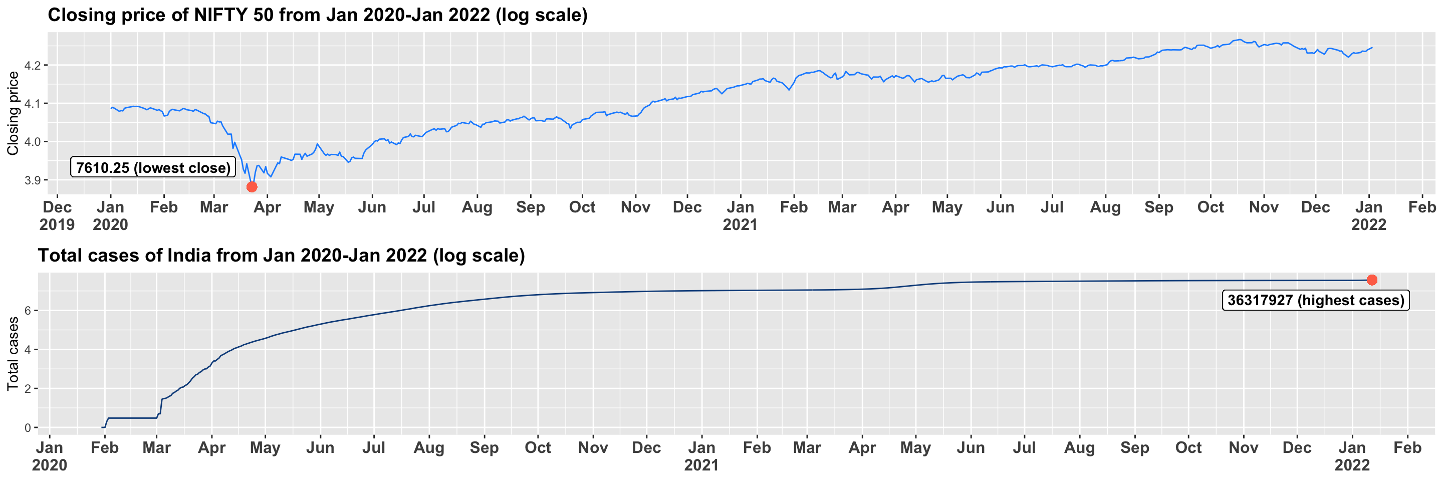
Figure 3.1.2.a Comparing cases of India and closing price for NIFTY 50
Similarly, according to KHAN et al. (2020) for the united kingdom the FTSE 100 saw a negative effect on its closing price per day during the short window between march and may of 2020 which we can corroborate with Figure 3.1.2.a. We see this pattern similar to NIFTY’s drop in closing price but here unlike NIFTY, the market in the UK seem to drop once more in November of 2020 before coming back to a balanced figure followed through late 2021. Again, we can see that due to covid-19 FTSE saw the lowest index price (4993.8) in over two years.
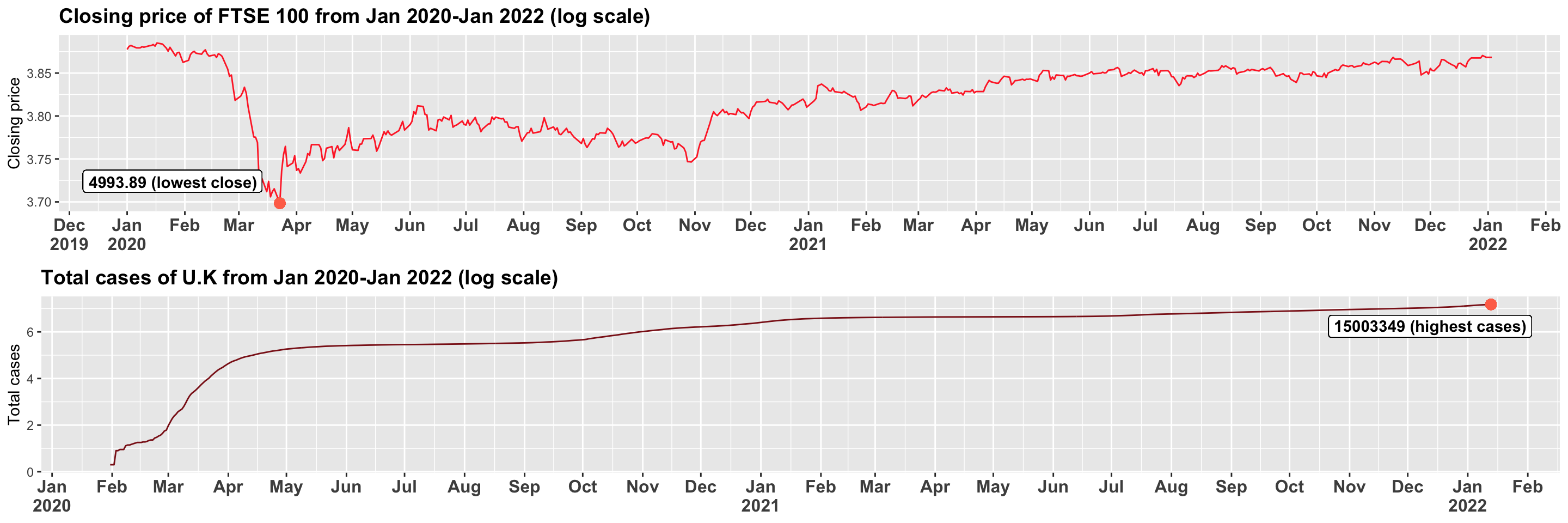
Figure 3.1.2.b Comparing cases of UK and closing price for FTSE 100
According to Frazier (2021), between March and April of 2020, the NYSE stock market experienced one of the largest crashes that it has ever seen in its history. Since there was no vaccination against Covid-19 found at the time, the market began to depreciate and saw its lowest closing price (8777.3) in over two years, which is similar to NIFTY and FTSE due to the rise in the number of total cases in the country. At the end of the year, however, the market began to recover from its slump and it gained more ground.
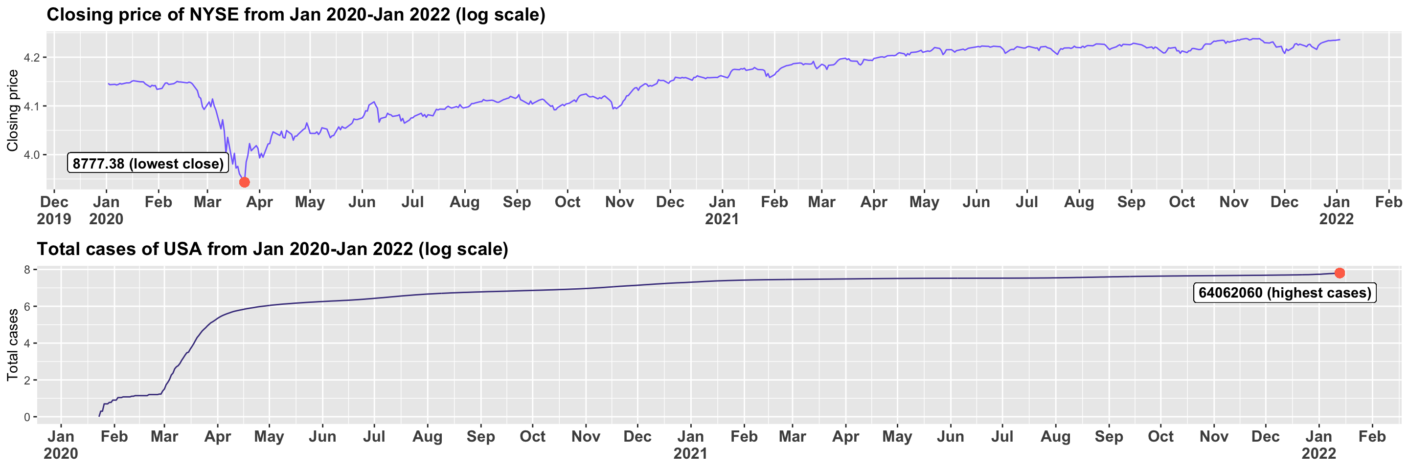
Figure 3.1.2.c Comparing cases of USA and closing price of NYSE
As described in section 2.2.1, we created a column named change percentage, which was calculated according to the percentage change in closing prices each day. Based on this column, we could determine how the market actually fluctuates during a given time period. An initial step was the creation of a histogram for each of the three markets for the change percentage to illustrate the spread of these fluctuations, as shown in Figure 3.1.2.d. In all three of these markets, the change is typically within a range of -2 to 2 percent, with the exceptions reaching as high as 5 or even above 10 in some cases. Therefore, most of the fluctuations were small for all three markets, which suggests some stability. In contrast, the exceptions tell us that either the market crashed severely or was able to rebound from it. In terms of distribution, the histograms in Figure 3.1.2.d looks like normal distribution but when the respective datasets were tested with the help of “shapiro.test()” method in R each market returned a p-value of <0.05 which indicates that none of these follow normal distribution. Hence, non-parametric methods were used to create predictive models since the dependent variable in our case is “change percentage”.
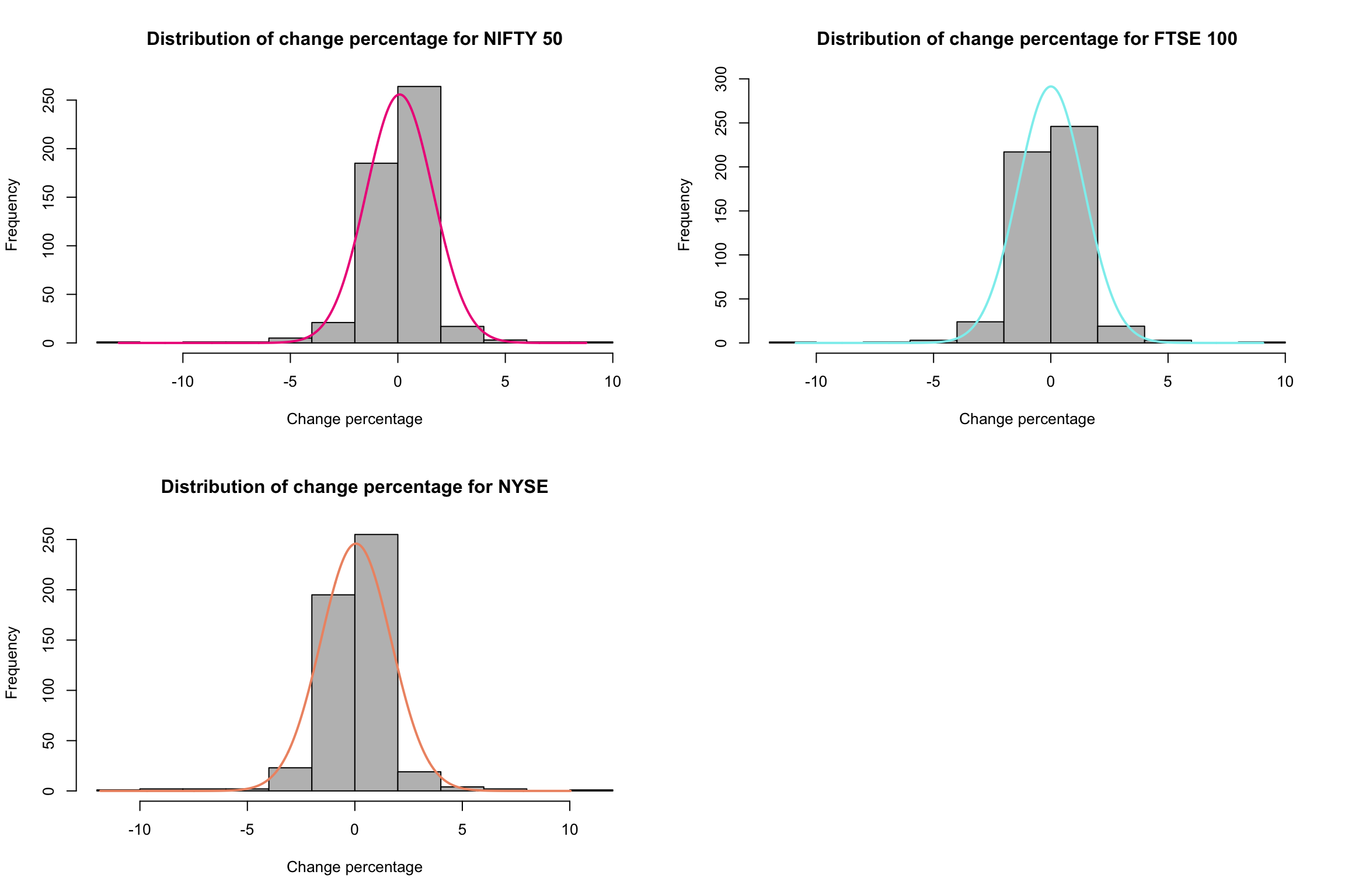
Figure 3.1.2.d Distribution of calculated change percentage
To validate this let’s take a look at the events followed from Jan 2020 to Jan 2022 in terms of change percentage as shown in Figure 3.1.2.e. As discussed previously, March 2020 to Apr 2020 was the time when each country, India, UK and USA were impacted both in terms of covid factors like total number of cases, deaths, tests and stock markets crashes in NIFTY, FTSE, NYSE respectively. This is now corroborated with change percentage too, where during this same time period of March 2020 to April 2020, each market saw the highest fluctuations. According to Press Trust of India (2020), on 23rd of March 2020 NIFTY crashed with 12.9 percent in the first hour of opening due to covid-19, we can validate this from Figure 3.1.2.e.
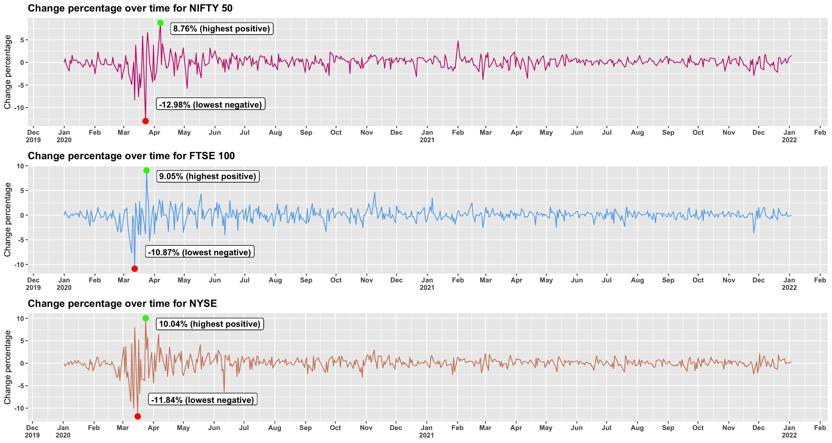
Figure 3.1.2.e Change percentage over time
Similarly, NYSE saw a crash with 11.84 percent crash in the middle of March of 2020 this can be validated from Imbert (2020) which tells us that the drop was more than 11 percent and was the third largest one day drop for daw jones. As for FTSE, it also saw the second largest crash in the history of the market of about 11.84 percent.
3.1.3. Correlation between covid and stock factors
Figures 3.1.3.a to 3.1.3.c shows correlation between all independent variables and dependent variables for NIFTY, FTSE and NYSE respectively. A strong correlation can be seen between close, open, high, low and covid factors like, total cases, deaths, positive rate, tests, and vaccinations. Since we’ll be working with random forests regression it is important to note that this can help the model since change percentage is correlated to all stock factors and this chain of correlation can help the trees to grow. Moreover, it is also important to note that the importance of these independent variables can be different for each of the three models.
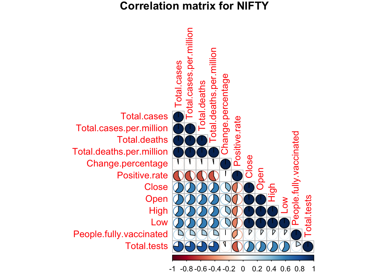
Figure 3.1.3.a NIFTY correlation
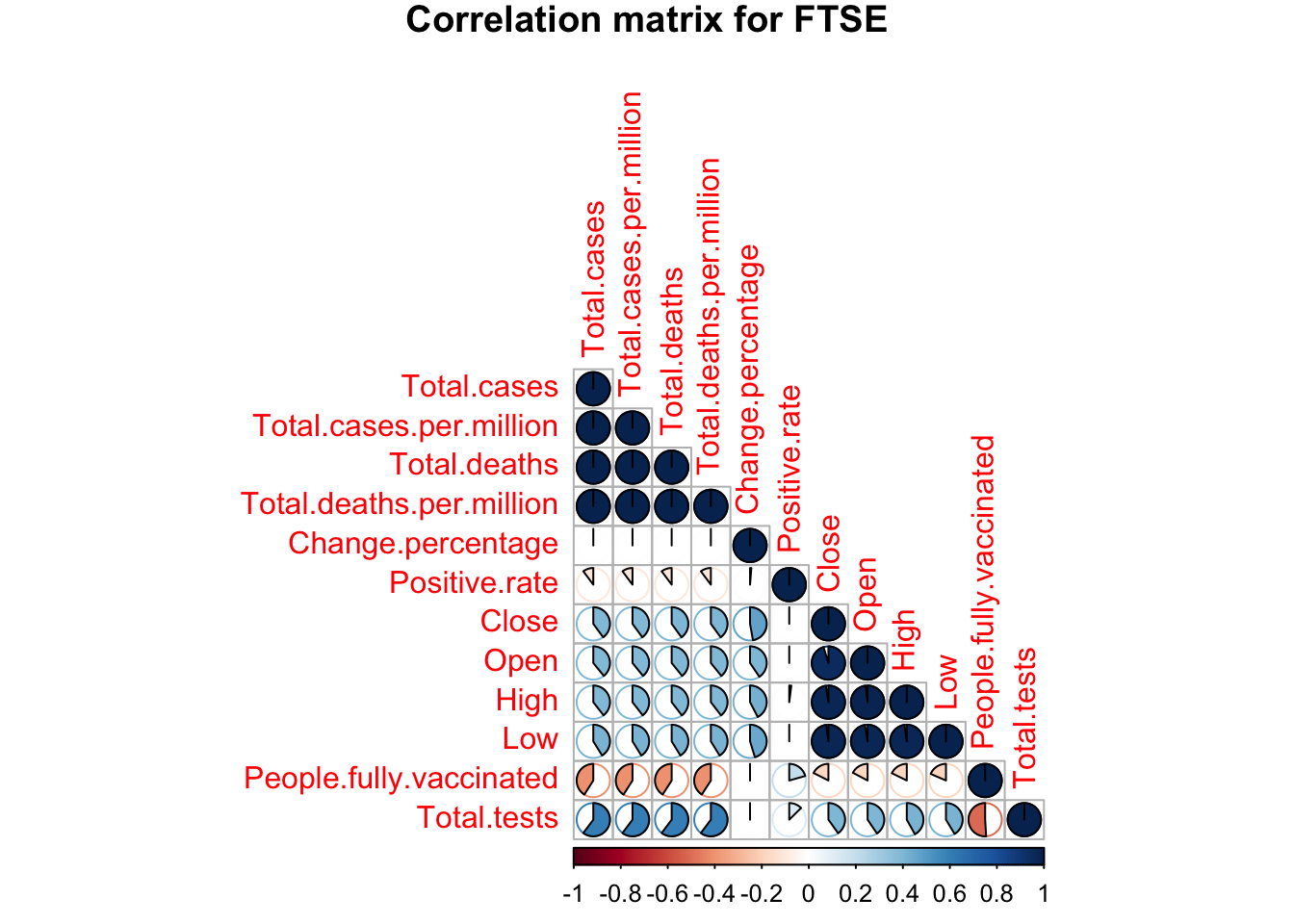
Figure 3.1.3.b FTSE correlation
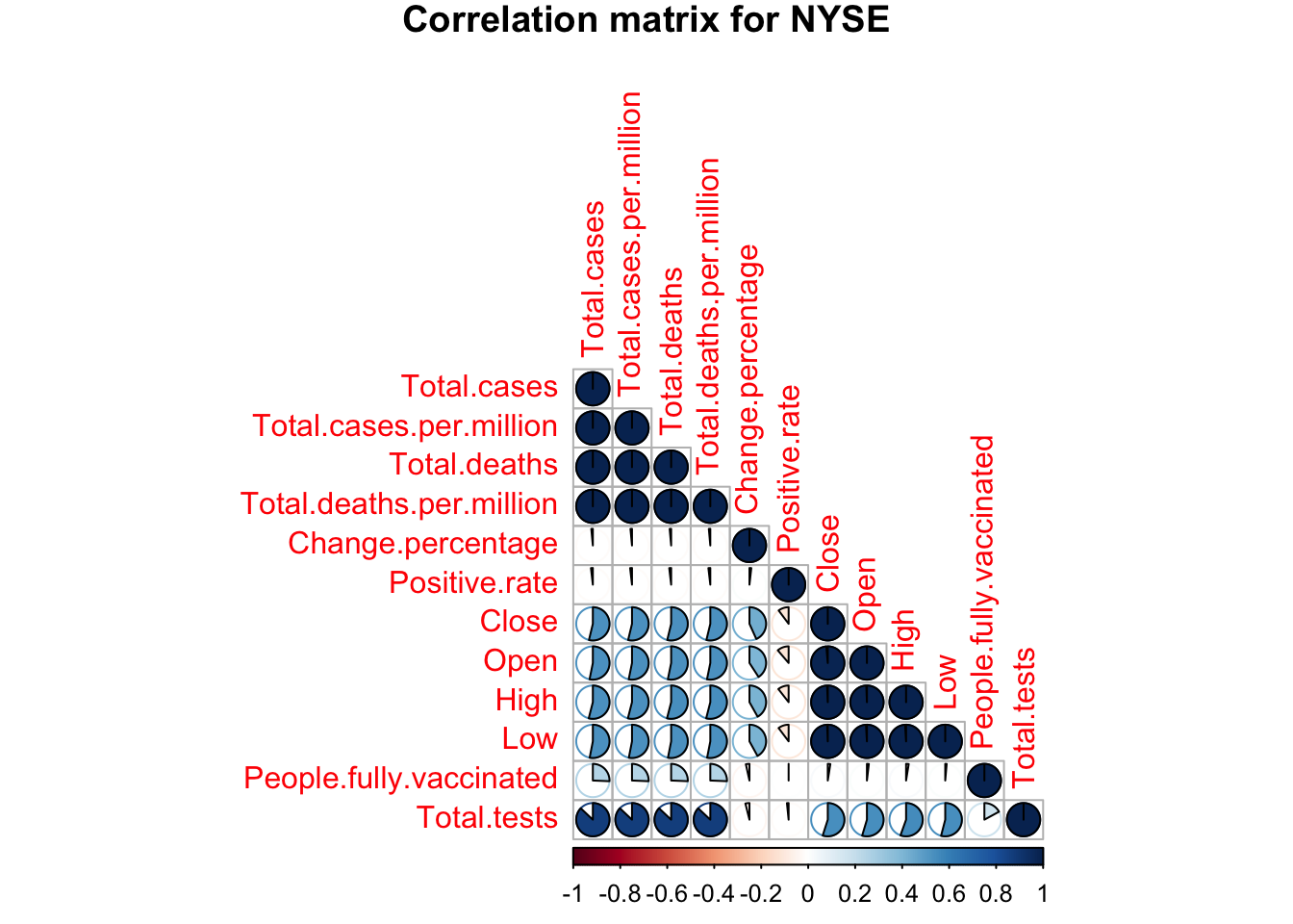
Figure 3.1.3.c NYSE correlation
Analysis
Following the discussion in section 2.2.4, the datasets are divided into training and testing data by 80 percent and 20 percent respectively. Figure 3.2.a illustrates the initial random forest regression models developed for the mentioned three markets. The initial models in the mentioned figure showed that the number of trees in the forests can be reduced to obtain an optimal model (with lowest error). This was found to be 675 trees for NIFTY, 50 trees for FTSE and 914 trees for NYSE respectively. The reduced models were then created for all three markets again.
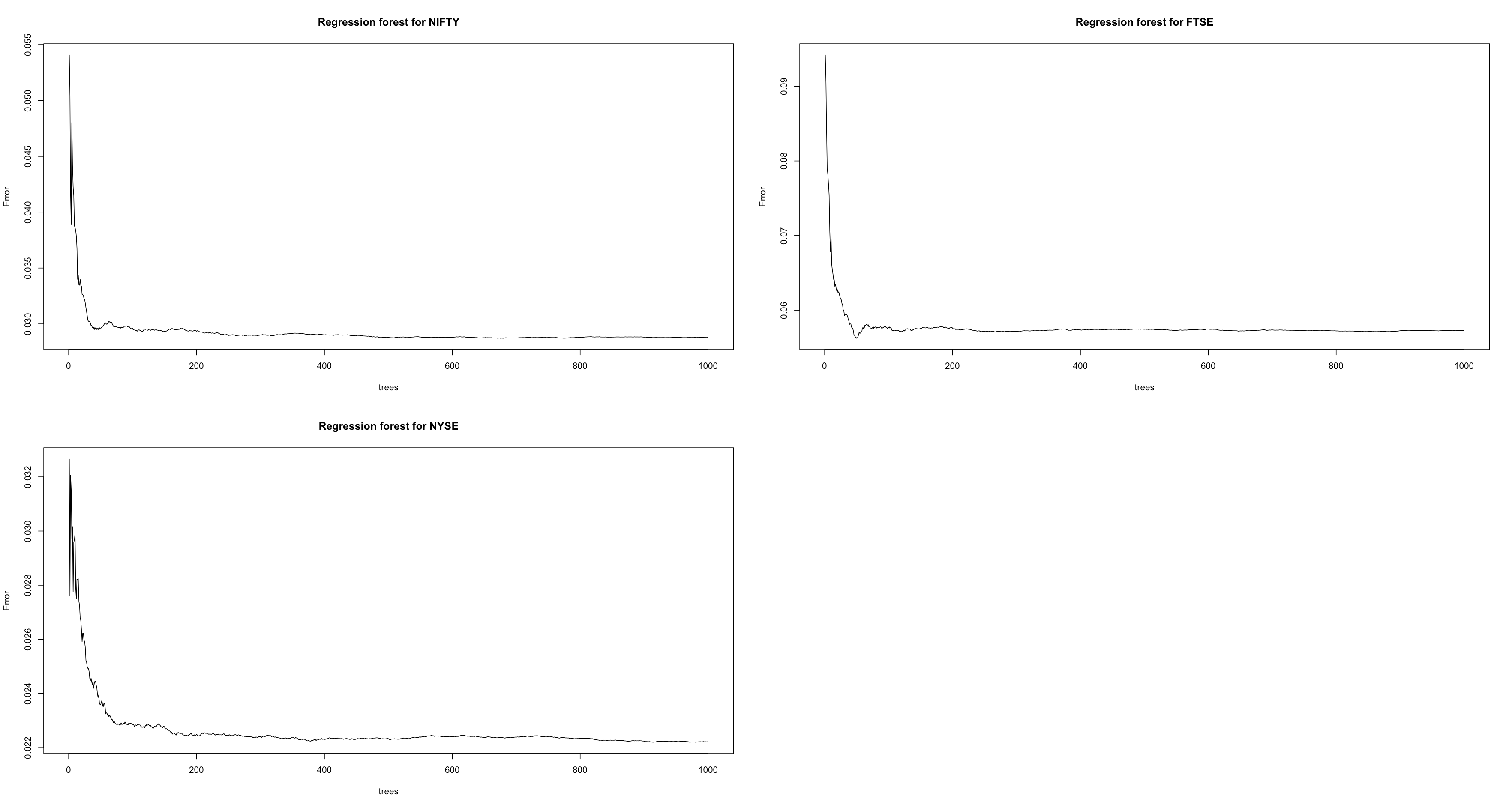
Figure 3.2.a Initial regression trees for all three markets
Figure 3.2.b shows the top 10 variables according to their importance in the regression forest(s). To begin with, in NIFTY 50 the stock variables are quite significant, however, other variables such as number of people fully vaccinated, the number of new tests taken, and the positive rate, are also significant in the model since their purity rate is good, and the p-value is less than 0.1. For FTSE 100, we see a massive increase in MSE for new tests and even new tests per thousand which are one of the top variables for this model. Other variables like positive rate, total vaccinations, and new cases were included in the top variables too. As for NYSE, we observe a similar pattern for covid factors with four variables being in the top variables and the other four being the variables from stock dataset.
| Random Forest Regression Model | Method | Accuracy |
|---|---|---|
| NIFTY | Pearson | 74.03% |
| Spearman | 58.25% | |
| FTSE | Pearson | 49.27% |
| Spearman | 49.40% | |
| NYSE | Pearson | 69.55% |
| Spearman | 51.64% |
Table 3.2 Accuracy of all three markets for created Random Forest Regression models
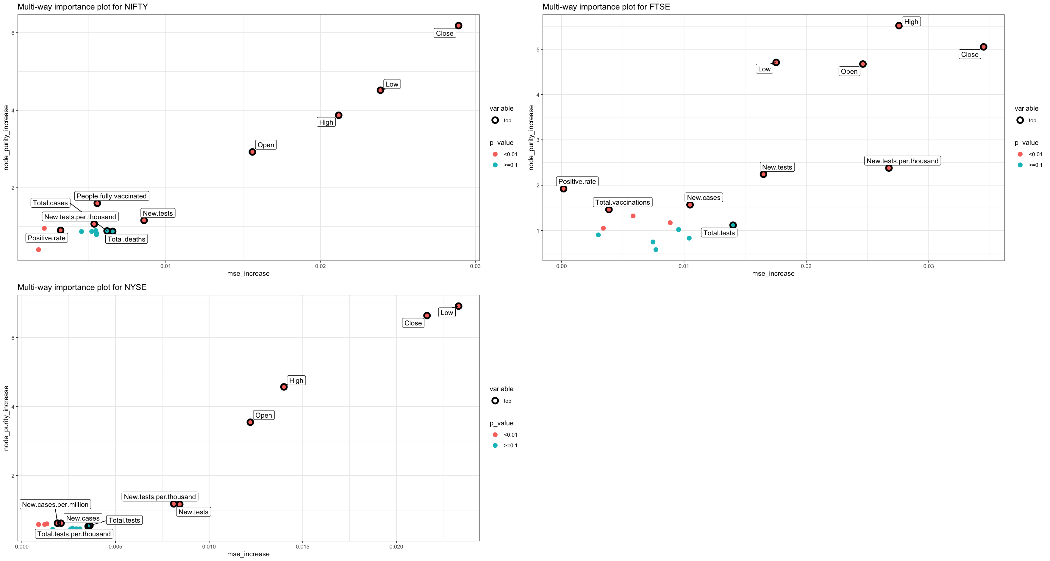
Figure 3.2.b Importance of variables in all three regression models
Figure 3.2.c shows all the measures of our NIFTY model and also the correlation between them. As we can see here, all the correlations are above 0.5 and quite high. We can observe the same pattern with FTSE and NYSE in Figures 3.2.d and 3.2.e respectively. Moreover, int terms of measures it is also important to see the accuracy of our models with the test data (20% of our original data) which the regression model has not seen yet. Since, our data had several outliers, instead of only choosing to calculate the accuracy by finding the correlation between predicted and actual values in R’s default “Pearson method” which is sensitive to outliers (Kim et al., 2015), Spearman method (robust for outliers (Kim et al., 2015)) was also evaluated simultaneously. Table 3.2 shows the accuracy scores with both methods for all three markets.
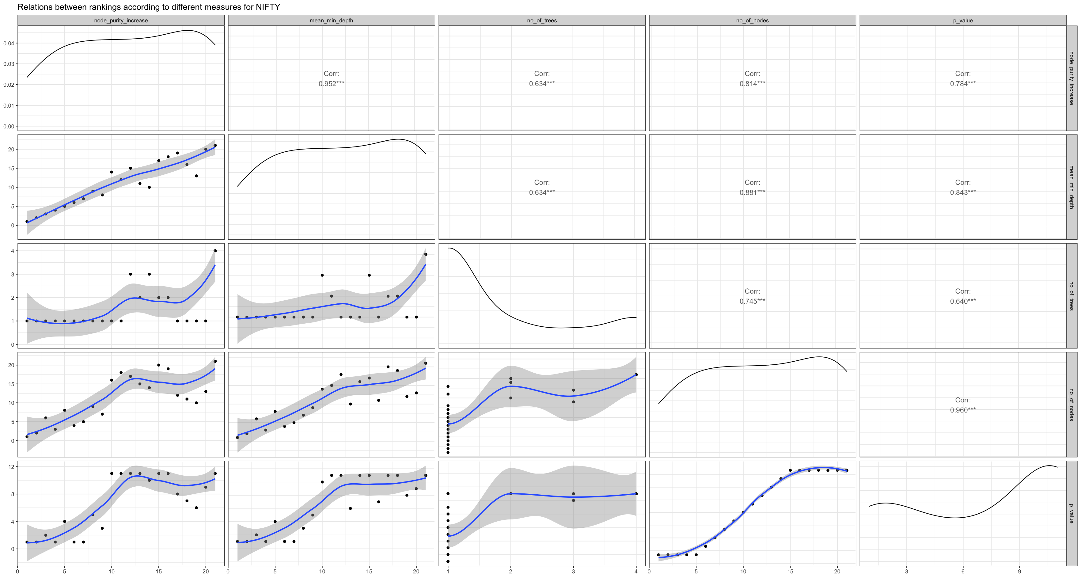
Figure 3.2.c Relations between rankings for NIFTY
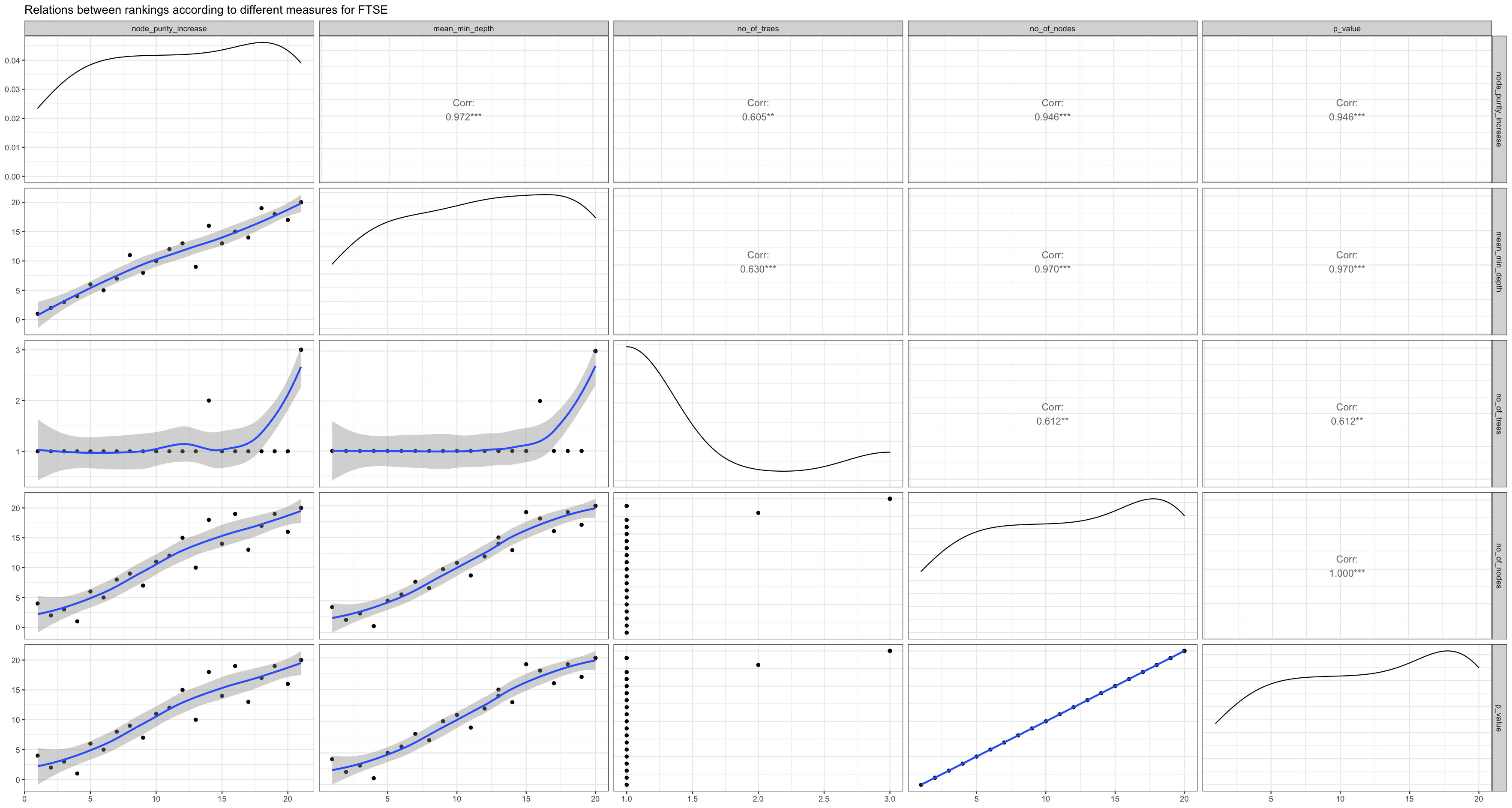
Figure 3.2.d Relations between rankings for FTSE
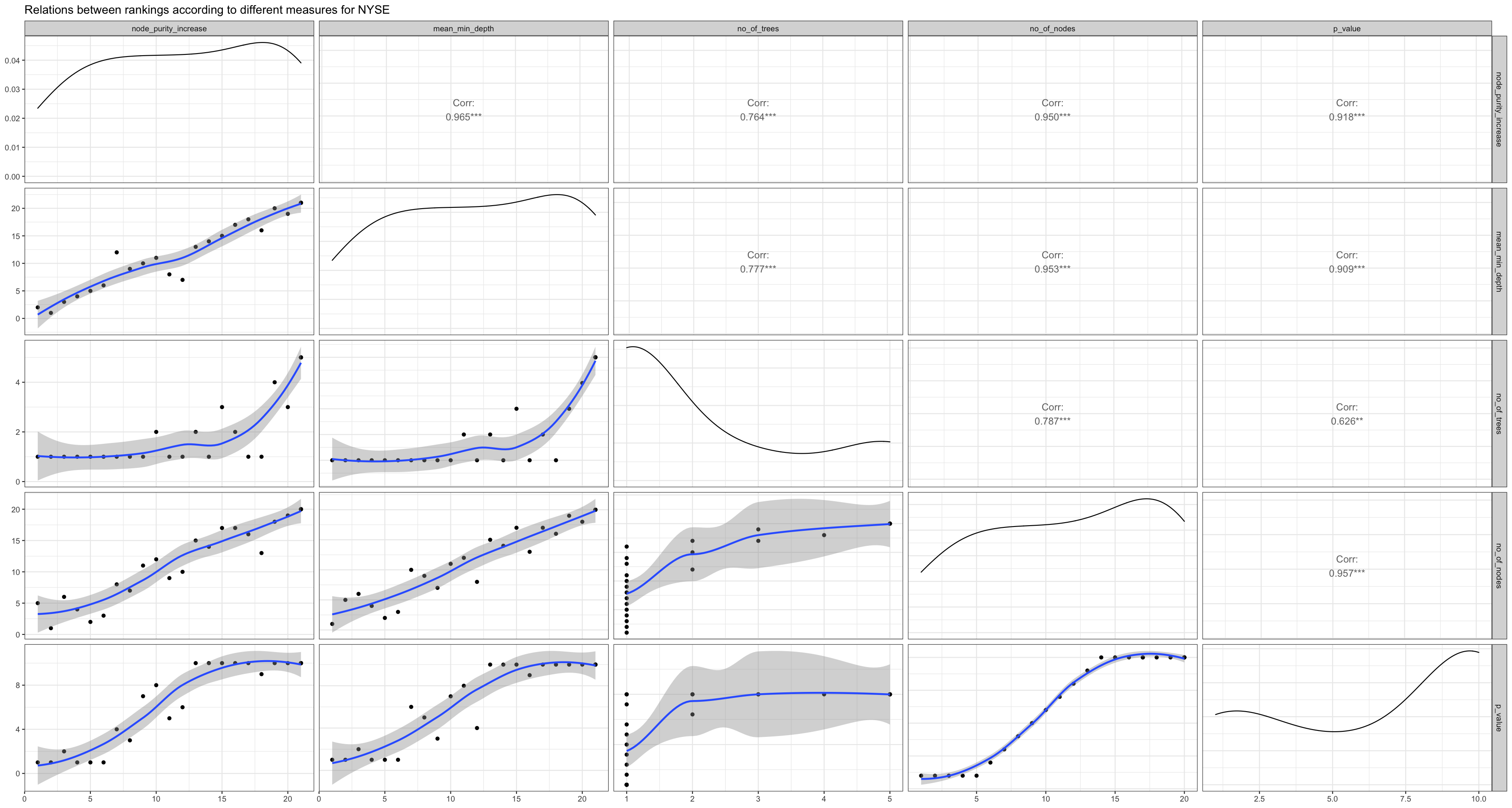
Figure 3.2.e Relations between rankings for NYSE
Conclusion
The main objective of this report was to find trends between covid factors and stock markets events as well as to make a predictive model to forecast stock market change per day. The result clearly highlighted that there was a short term (March to April 2020) effect of covid-19 on these markets. Particularly, the number of cases and deaths were correlated to the stock market crash quite well. The event analysis also showed that even before the number of cases began to rise, the stock market’s prices started diving down. This shows that the panic among people can cause the market to crash even before something drastic happens. Market crashes were also analysed as an event analysis and for all three markets it was found that the crashes were the worst for over two years due to covid-19. Moreover, a prediction model was also created to predict the change in percentage per day for NIFTY 50, FTSE 100 and NYSE respectively. Accuracy scores of around 49 percent to 74 percent we achieved, lowest being 49 percent for FTSE 100 and highest being 74 percent for NIFTY 50. There are two limitations of this report, firstly, since we are using random forest regression accuracy scores can change slightly each time we grow a forest, its best here to create multiple models and choose the best one to predict new values. Secondly, predicting anything in a financial market is very complex task and it rarely works for a long term duration (Stibel, 2014). Having only been able to detect trends during a short period of time in which events due to COVID-19 were drastic, the model may not be valid if future events differ from the ones observed. The final takeaway from this report is that covid-19 had a major impact on stock market and covid factors such as number of cases, deaths, vaccinations, and number of tests could potentially be used to find the stock market’s movements since these events can be directly related to closing price per day for each market.
References
Akmam, E. F., Siswantining, T., Soemartojo, S. M., & Sarwinda, D. (2019). Multiple Imputation with Predictive Mean Matching Method for Numerical Missing Data. 2019 3rd International Conference on Informatics and Computational Sciences (ICICoS). https://doi.org/10.1109/icicos48119.2019.8982510
ALAM, M. N., ALAM, M. S., & CHAVALI, K. (2020). Stock Market Response during COVID-19 Lockdown Period in India: An Event Study. The Journal of Asian Finance, Economics and Business, 7(7), 131–137. https://doi.org/10.13106/jafeb.2020.vol7.no7.131
Al-Awadhi, A. M., Alsaifi, K., Al-Awadhi, A., & Alhammadi, S. (2020). Death and contagious infectious diseases: Impact of the COVID-19 virus on stock market returns. Journal of Behavioral and Experimental Finance, 27, 100326. https://doi.org/10.1016/j.jbef.2020.100326
Azeroual, O. (2020). Data Wrangling in Database Systems: Purging of Dirty Data. Data, 5(2), 50. https://doi.org/10.3390/data5020050
Chahuán-Jiménez, K., Rubilar, R., de la Fuente-Mella, H., & Leiva, V. (2021). Breakpoint Analysis for the COVID-19 Pandemic and Its Effect on the Stock Markets. Entropy, 23(1), 100. https://doi.org/10.3390/e23010100
Cotton, R. (2013). Learning R. Van Duuren Media.
Frazier, L. (2021, June 28). The Coronavirus Crash Of 2020, And The Investing Lesson It Taught Us. Forbes. https://www.forbes.com/sites/lizfrazierpeck/2021/02/11/the-coronavirus-crash-of-2020-and-the-investing-lesson-it-taught-us/?sh=3f21211846cf
Garnier, S., Ross, N., Rudis, R., Camargo, A. P., Sciaini, M., & Scherer, C. (2021). viridis (0.6.2) [Rvision - Colorblind-Friendly Color Maps for R]. https://cran.r-project.org/web/packages/viridis/index.html
Gettleman, J., & Schultz, K. (2020, March 25). Coronavirus in India: Modi Orders Total Lockdown of 21 Days. The New York Times. https://www.nytimes.com/2020/03/24/world/asia/india-coronavirus-lockdown.html
Ghazali, S. M., Shaadan, N., & Idrus, Z. (2021). A Comparative Study of Several EOF Based Imputation Methods for Long Gap Missing Values in a Single-Site Temporal Time Dependent (SSTTD) Air Quality (PM10) Dataset. Pertanika Journal of Science and Technology, 29(4). https://doi.org/10.47836/pjst.29.4.21
Grus, J. (2019). Data Science from Scratch: First Principles with Python (2nd ed.). O’Reilly Media.
Harrell Jr, F. E. (2021). Hmisc (4.6-0) [Harrell Miscellaneous. R package version 4.6-0]. https://CRAN.R-project.org/package=Hmisc
Hegde, H., Shimpi, N., Panny, A., Glurich, I., Christie, P., & Acharya, A. (2019). MICE vs PPCA: Missing data imputation in healthcare. Informatics in Medicine Unlocked, 17, 100275. https://doi.org/10.1016/j.imu.2019.100275
Iacobucci, G. (2020). Covid-19: UK lockdown is “crucial” to saving lives, say doctors and scientists. BMJ, m1204. https://doi.org/10.1136/bmj.m1204
Imbert, F. (2020, March 16). Dow drops nearly 3,000 points, as coronavirus collapse continues; worst day since ’87. CNBC. https://www.cnbc.com/2020/03/15/traders-await-futures-open-after-fed-cuts-rates-launches-easing-program.html
Jones, B. (2014). Communicating Data with Tableau: Designing, Developing, and Delivering Data Visualizations (1st ed.). O’Reilly Media.
Kassambara, A. (2019). Practical Statistics in R for Comparing Groups: Numerical Variables. Independently published.
KHAN, K., ZHAO, H., ZHANG, H., YANG, H., SHAH, M. H., & JAHANGER, A. (2020). The Impact of COVID-19 Pandemic on Stock Markets: An Empirical Analysis of World Major Stock Indices. The Journal of Asian Finance, Economics and Business, 7(7), 463–474. https://doi.org/10.13106/jafeb.2020.vol7.no7.463
Kim, Y., Kim, T. H., & Ergün, T. (2015). The instability of the Pearson correlation coefficient in the presence of coincidental outliers. Finance Research Letters, 13, 243–257. https://doi.org/10.1016/j.frl.2014.12.005
Komsta, L., & Novomestky, F. (2015). moments (0.14) [Moments, cumulants, skewness, kurtosis and related tests. R package version 0.14]. https://CRAN.R-project.org/package=moments
Lee, D. K. (2020). Data transformation: a focus on the interpretation. Korean Journal of Anesthesiology, 73(6), 503–508. https://doi.org/10.4097/kja.20137
Liaw, A., & Wiener, M. (2002). randomForest [Classification and Regression by randomForest]. R News 2(3), 18–22.
Lin, W. C., & Tsai, C. F. (2019). Missing value imputation: a review and analysis of the literature (2006–2017). Artificial Intelligence Review, 53(2), 1487–1509. https://doi.org/10.1007/s10462-019-09709-4
Madley-Dowd, P., Hughes, R., Tilling, K., & Heron, J. (2019). The proportion of missing data should not be used to guide decisions on multiple imputation. Journal of Clinical Epidemiology, 110, 63–73. https://doi.org/10.1016/j.jclinepi.2019.02.016
Mangiafico, S. (2022). rcompanion [Functions to Support Extension Education Program Evaluation]. https://CRAN.R-project.org/package=rcompanion
Nicola, M., Alsafi, Z., Sohrabi, C., Kerwan, A., Al-Jabir, A., Iosifidis, C., Agha, M., & Agha, R. (2020). The socio-economic implications of the coronavirus pandemic (COVID-19): A review. International Journal of Surgery, 78, 185–193. https://doi.org/10.1016/j.ijsu.2020.04.018
O’Neil, C., & Schutt, R. (2013). Doing Data Science. O’Reilly.
Ouedraogo, I., Defourny, P., & Vanclooster, M. (2018). Application of random forest regression and comparison of its performance to multiple linear regression in modeling groundwater nitrate concentration at the African continent scale. Hydrogeology Journal, 27(3), 1081–1098. https://doi.org/10.1007/s10040-018-1900-5
Paluszynsk, A., Biecek, P., & Jiang, Y. (2020). randomForestExplainer [Explaining and Visualizing Random Forests in Terms of Variable Importance. R package version 0.10.1]. https://CRAN.R-project.org/package=randomForestExplainer
Pawluszek-Filipiak, K., & Borkowski, A. (2020). On the Importance of Train–Test Split Ratio of Datasets in Automatic Landslide Detection by Supervised Classification. Remote Sensing, 12(18), 3054. https://doi.org/10.3390/rs12183054
Press Trust of India. (2020, March 23). Market bleeds: Sensex, Nifty post worst ever one-day crash. India Today. https://www.indiatoday.in/business/story/market-closing-march-23-bleeds-sensex-nifty-post-worst-ever-one-day-crash-1658777-2020-03-23
Singh, G., & Shaik, M. (2021). The Short-Term Impact of COVID-19 on Global Stock Market Indices. Contemporary Economics, 15(1), 1–18. https://doi.org/10.5709/ce.1897-9254.432
Stibel, J. (2014, July 23). Why We Can’t Predict Financial Markets. Harvard Business Review. https://hbr.org/2009/01/why-we-cant-predict-financial
Tierney, N. (2017). visdat: Visualising Whole Data Frames. The Journal of Open Source Software, 2(16), 355. https://doi.org/10.21105/joss.00355
University, The Open. (2016). Interpreting Data: Boxplots and tables (1st ed.) [E-book]. The Open University.
Wickham, H., & Seidel, D. (2020). scales (1.1.1) [Scale Functions for Visualization. R package version 1.1.1]. https://CRAN.R-project.org/package=scales
Wilke, C. O. (2020). cowplot (1.1.1) [Streamlined Plot Theme and Plot Annotations for ‘ggplot2’. R package version 1.1.1]. https://CRAN.R-project.org/package=cowplot
