Splitwise - a user research case study
Projects | | Links:
- Identifying and describing the interface
- Typical user of this system
- Tasks to be completed by the user
- Theories of design
- Cognitive walkthrough and Heuristic evaluation
- Recommendations
Identifying and describing the interface
Background
Splitwise is a US-based mobile based application with a single goal in mind i.e., keeping track of shared expenses with friends, family, and groups. Since its launch, the application has made transactions worth more than $90 billion (Reiff, 2021).
Current interface
The current interface follows a single page navigation layout in Figure 1 with 5 tabs designated for different actions. Figure 1 shows the dashboard with 3 separate regions where the user can achieve their goals. Here, first region shows a button which can be used to add a new expense i.e., clicking this button will lead to the screen shown in Figure 2. The second region shows the list of added acquaintances (friends and groups) which can be seen in Figures 1 and 3 respectively. In the third region, users can click on activity to see their recent activities as shown in Figure 4. Moreover, Figure 5 shows how a user can settle an expense, this can either be recorded as an offline cash transaction or in some countries like India or US third party payment apps like PayTM can be used to pay the friends and family in-app (Bittner, 2017).
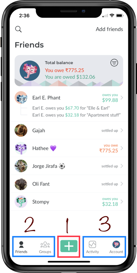
Figure 1: Splitwise Homepage + Owed Friends list
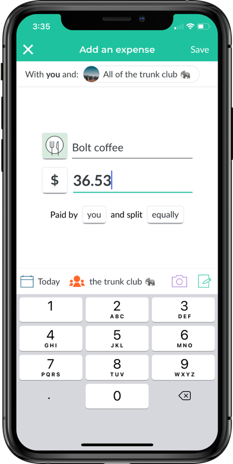
Figure 2: Adding a new expense
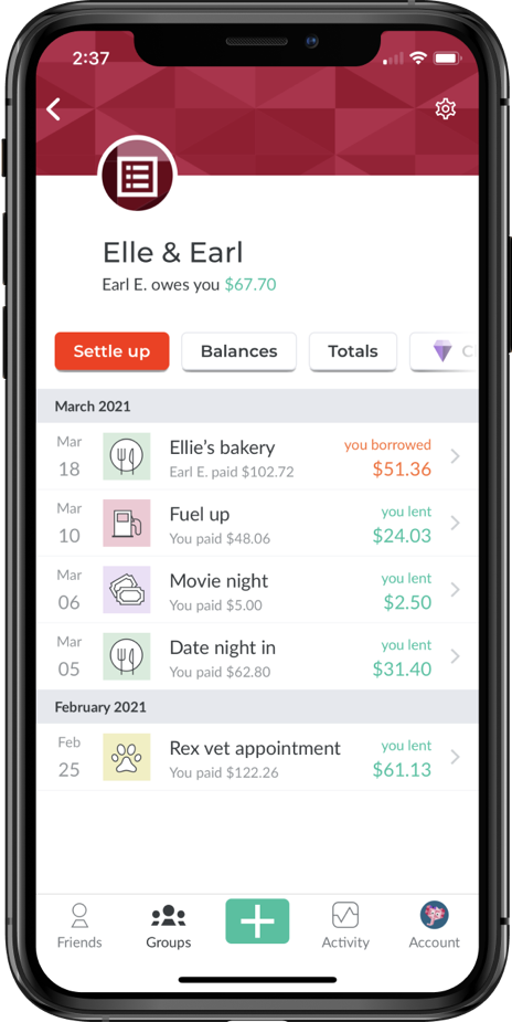
Figure 3: Owed group list
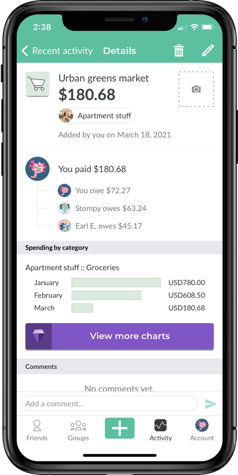
Figure 4: Recent activity screen
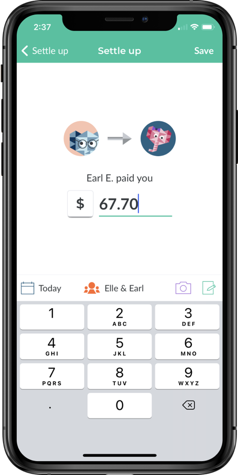
Figure 5: Settling an expense
Typical user of this system
As of April 2022, Splitwise has a demographic of approximately 57% male users and 43% female users with majority of the users belonging to the age group of 11-34 (Splitwise Traffic Analytics & Market Share, 2022). To understand the primary motivations of the users and also the reasons for any dissatisfactions with the application, it is important to create a detailed user persona with outlining the user’s needs, behaviour and preferences (Pruitt & Adlin, 2006).
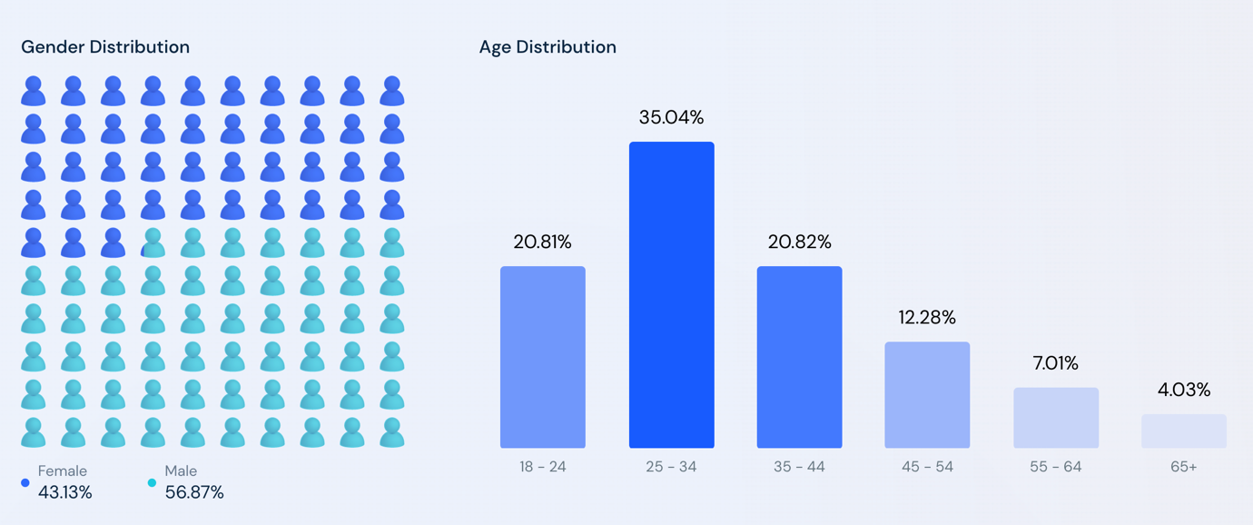
Figure 6: Audience demographic By, Splitwise Traffic Analytics & Market Share, 2022s
User persona
Background
Kate Mcconnell is a 27 years old female Canadian who just relocated to the United Kingdom with her friends who are all doing MBA from the same university. She is also an extrovert who likes to make new connections and go out for social gatherings frequently.
Frustrations
- Doesn’t like to keep track of all people who owe her money
- Doesn’t like to keep track of different currencies since she travels a lot
- Some friends don’t use Splitwise
- Remembering if friends settled owed expenses
Goals
- Invite friends to Splitwise who want to split group expenses
- Wants to split expenses without having to calculate individual dues in a group
To simplify the persona mentioned above, consider Kate going out with her university study group to dinner and getting a discount on her account, but only she can pay with her debit card. So she pays for everybody and invites them to Splitwise to add expenses. Then, her friends can settle the bills when they can. Furthermore, she might return to Canada for Christmas and may use Splitwise with her cousins in a different currency.
Tasks to be completed by the user
For the purposes of this case, we’ll be using the cognitive task analysis method “GOMS” (Goals, Operators, Methods, and Selection rules) to analyse the goals given above according the mentioned user persona.
Task 1: Invite friends
Goal
The goal of this task is to invite friends who are not yet on Splitwise so they can settle their expenses, or add expenses, on the application.
Operations
Available actions for this task are:
- Go to Home screen
- Tap on Add Friends button
- Open Accounts tab
- Tap on scan code button
- Tap on My Code
- Share code with friends
Methods
The methods available to achieve the mentioned goal are:
Add Friends
User can add friends using the method given in Figure 7 below.
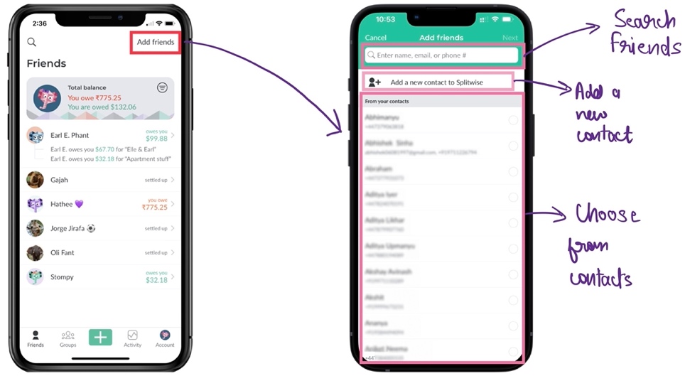
Figure 7: Add friends’ method to invite new friends to Splitwise
Scan code
Users can invite new friends to Splitwise using the method “scan code” as shown in Figure 8 below.
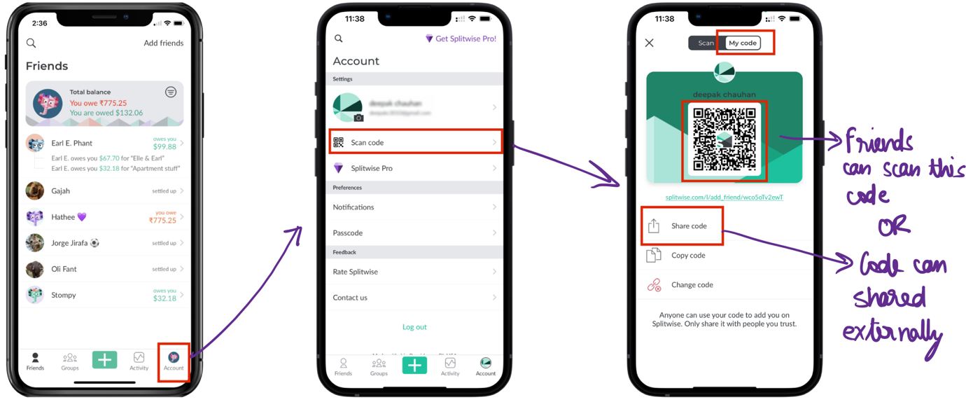
Figure 8: Scan code method to invite users to Splitwise
Selection Rules
If the person to be invited is already in the contact list, then add friends method would be used otherwise scan code method would be chosen because it is faster to scan code then to invite a new contact via method 1.
Task 2: Split expenses without calculating dues
Goal
The goal here is to split new expenses amongst friends without calculating each share
Operations
- Choose payee
- Choose currency and amount
- Choose split options
Methods
For all the methods the steps in Figure 9 are common. Moreover, all the different methods are given in Figure 10.
- Split by equally: Here, shares are divided equally
- Split by exact amount: Split are divided by mentioned amount
- Split by percentage: Split by given percentage
- Split by shares: Split by shares worth a given amount
- Split by adjustment: Split by who owes extra (and app will divide rest automatically)
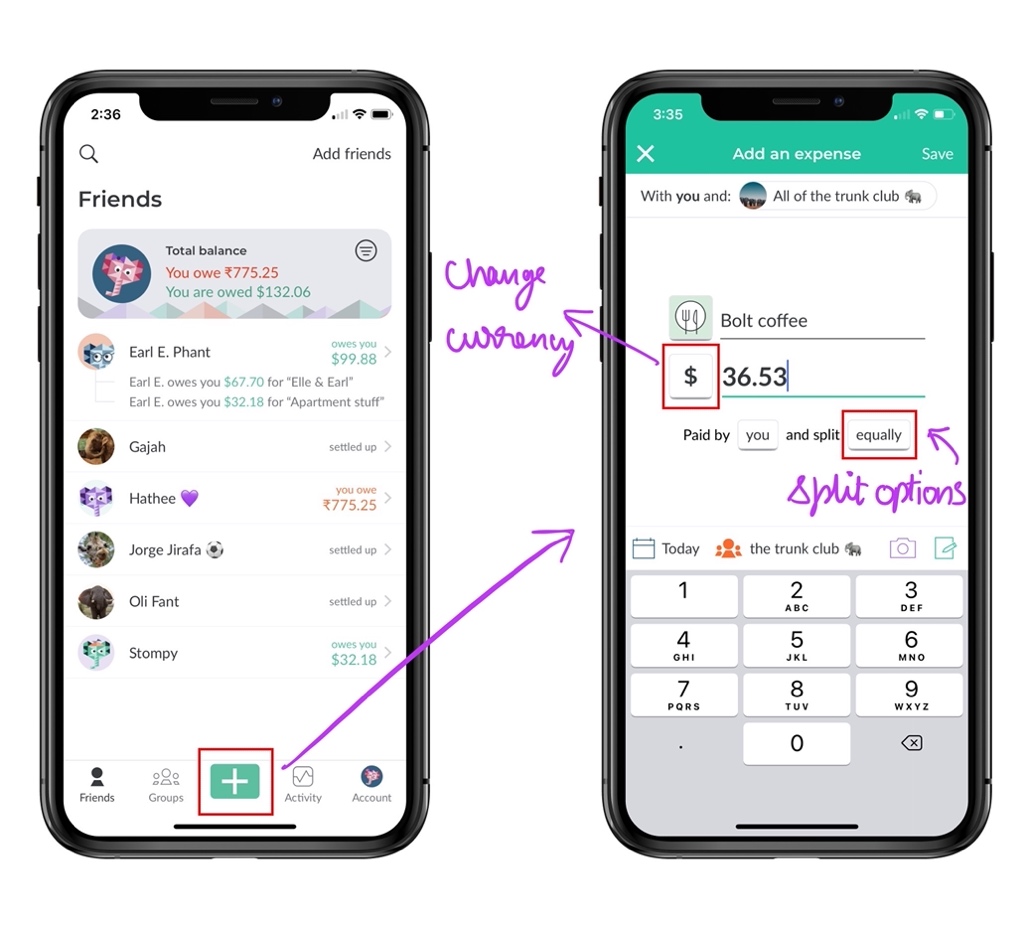
Figure 9: Common steps for all methods
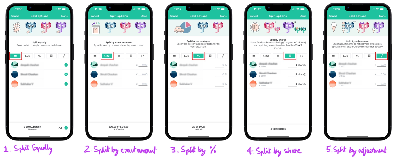
Figure 10: 5 different methods to split the expenses amongst friends
Selection rules
The selection rules are given in Figure 11.
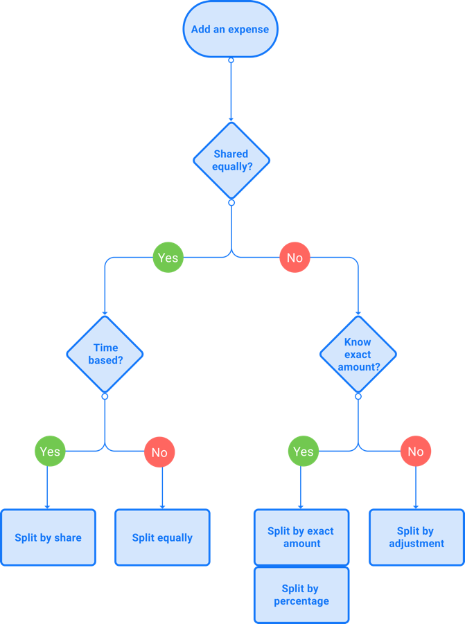
Figure 11: Selection rules for splitting expenses methods
Theories of design
Since the main feature of this application is to add expenses to split between people, let’s first focus on the add expense screen given in Figure 9. Here, we can see that while the user adds a new expense, the first step is to write a description of that expense and after that user moves on to the next fields. Hence, the user’s attention moves towards the bottom half of the screen and most of the time the icon on the left side of the description (used to classify this expense into categories like groceries, party, dinner, lunch etc) is ignored which can really help the user organise their expense and sort their spending accordingly. Here, gestalt’s principles could be used to increase attention to features like adding categories (Gal & Linchevski, 2010). Furthermore, Figure 10 shows all the methods available for the user to split the expense. Here, the user has too many methods available to do a simple split and in the scenario of an average user who is outside with a group and wants to add the expense quickly, the user would not be able to process this information quickly. If we investigate further using the seven stage cycle from Norman (2013, p. 41) given in Figure 12, we observe that the time taken for the user to interpret the action in choosing the best method for him is long and is often ignored. Moreover, according to Krug et al. (2014), especially for mobile applications where there are no cursors and the design is flat the user would not be able to interpret the design such as in Figure 12 where there is no segregation between the category button and white space which makes it difficult to interpret.
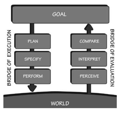
Figure 12: The Seven Stages of the Action Cycle, By, Norman (2013, p. 41).
Cognitive walkthrough and Heuristic evaluation
We will be using CoLiDeS for cognitive walkthrough in this case. Here, we’ll focus on two stages namely, attention and action respectively. To make it brief we will focus on task 1 (inviting user) for the walkthrough.
Stage 1: Attention
Since we have two possible methods to invite users to Splitwise, the user can parse either of those screens to subregions. The possible parsed subregions are given in Figures 13 and 14 respectively.
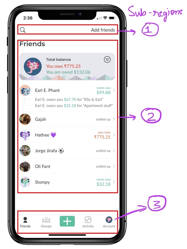
Figure 13: Subregions for Add friends action screen
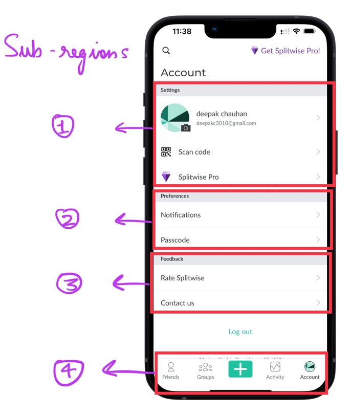
Figure 14: Subregions for Scan code action screen
As seen in Figure 13, there are 3 subregions in the homepage and to get closer to the goal (invite a new user), the user will have to focus on subregion 1 which describes the meta actions such as “Search” and “Add friends”. Next in Figure 14, there are more subregions than the previous screen, but since the subregions are sequentially sorted according to the priority the user’s focus will go on the “Scan code” button quickly.
Stage 2: Action
Here, after the user comprehends the focussed subregion and decides which action to take, the interface gives feedback in form of information and further actions. As shown in Figure 7 and 8 respectively. In case of Add friends feature, the interface shows the user all the known contacts in order to give a choice to choose from. Next, in case of Scan code feature, the interface again gives a choice either to scan the code directly from the screen or to share the code externally.
Heuristic evaluation
| Heuristic name | Valid? | Reason |
|---|---|---|
| Visibility of system status | Yes | The interface always shows current dues by default |
| Match between system and the real world | Yes | Symbols for party, groceries are used to simplify interpretation of categories |
| User control and freedom | Yes | Cancel and exist buttons are visible throughout the app |
| Consistency and standards | No | Some features like Simplify debt is hidden makes the learning curve steep |
| Error prevention | Yes | Error messages are shown throughout the app |
| Recognition rather than recall | Yes | Intuitive design helps the user to recognize things like expense category symbols, split method icons (using mental map) |
| Flexibility and efficiency of use | Yes | Novice users are slow to use the app & Expert users are quick due to better learnability |
| Aesthetic and minimalist design | No | Figure 10 shows too many available options for splitting the expense |
| Help users recognize, diagnose, and recover from errors | Yes | Timely notifications for debts and any errors are sent |
| Help and documentation | Yes | A short description for every action is given in the app, as shown in Figure 10 |
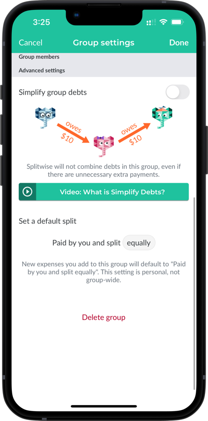
Figure 15: Simplify debts and delete group feature hidden in settings
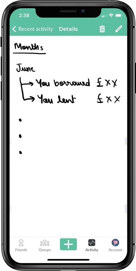
Figure 16: Recent activity redesigned (recommendation)
Recommendations
After the deep analysis of Splitwise interface we can see that the design is well thought and is widely used. For the novice users, the interface could be a bit underutilized since there are some vital features like Simplify debts (see Figure 15) which is hidden in the group settings rather than being an independent feature on the interface. This feature could also resolve the persona’s intention to save time and perform less transactions. Moreover, since the application’s goal is to help the user in keeping track of their finances, a screen like recent activity should redesigned in order to show cumulative monthly spent and expenses sorted according to categories (groceries, party, dinner etc). This will eventually help the user better spend money in the future. Figure 16 shows the redesigned recent activity screen which is organised by months. Moreover, a summary screen according to categories can be added to the application.
