British dominance in Formula 1
Projects | | Links:

- Knowledge building
- Theoretical frameworks
- Accessibility
- Visualisation choice
- Implications and Improvements
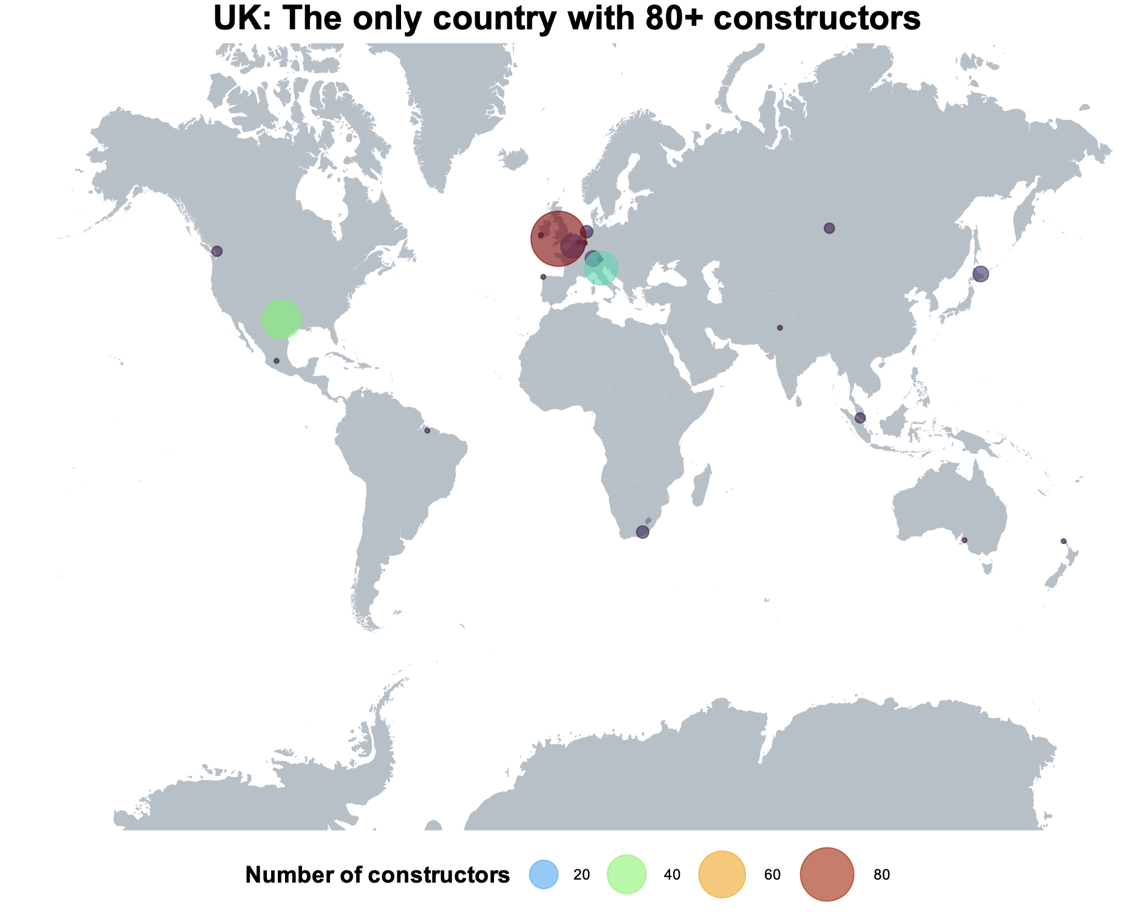
Figure 1: Number of constructors by nationality
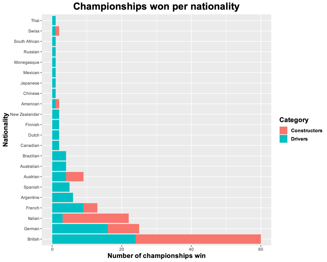
Figure 2: Championships won by countries
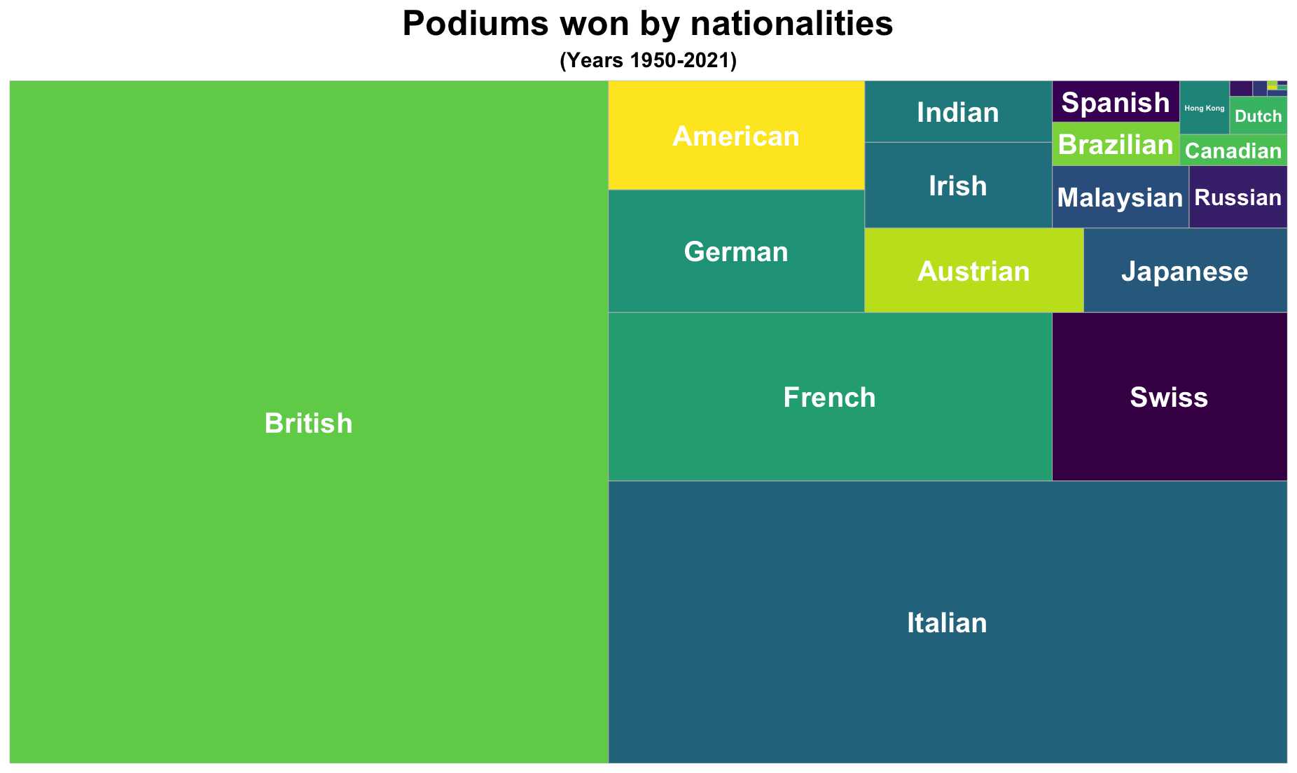
Figure 3: Podiums won by each country
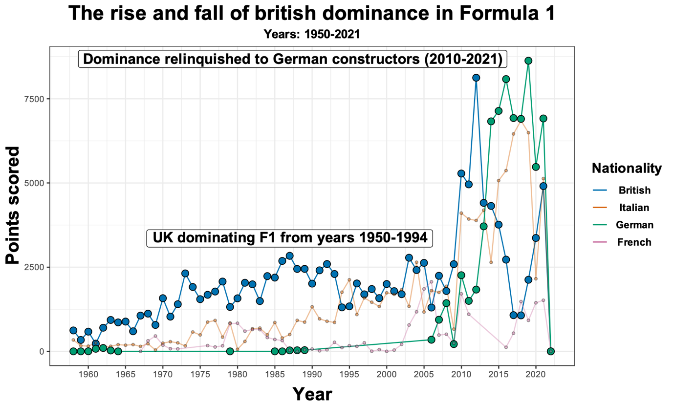
Figure 4: Rise and fall of British dominance in formula 1 (evolution over time): British constructors lost dominance to German constructors
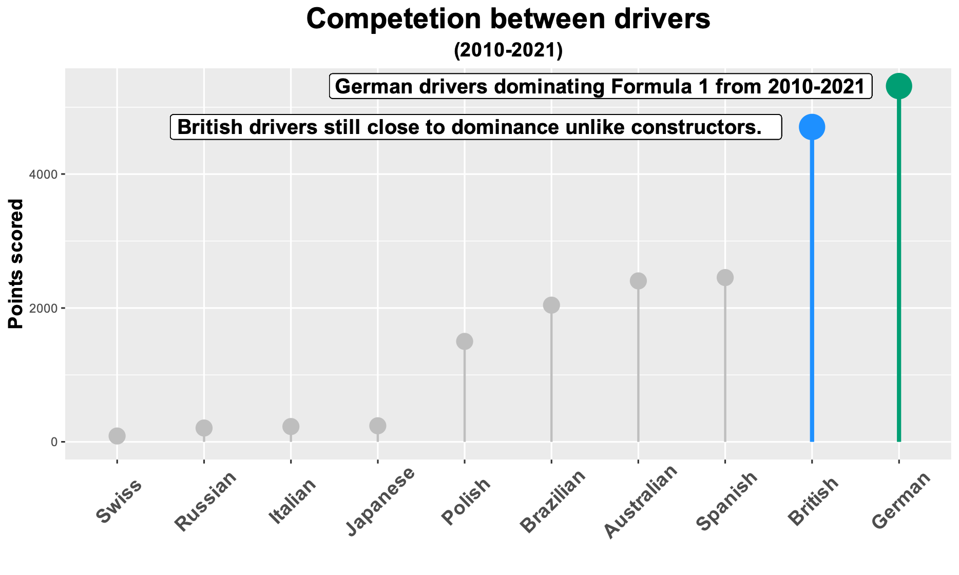
Figure 5: Competition between drivers from 2010 to 2021: UK lost dominance in Formula 1 to German drivers
Knowledge building
Background
In the world of motorsports, Formula 1 is the most prominent single-seater competition, which began in 1950 and continues to operate to this day in 21 countries and on 4 continents (Wright, 2001). During the Formula One world championships, drivers compete in races which are known as grand prix. If they are placed in the top three, they receive a podium trophy. Within the motorsports universe, Britain is highly regarded for the high level of technological development it has achieved in motorsports, as well as the high quality of drivers it provides to the Formula 1 team and to motorsport in general (Couldwell, 2012, pp. 271–369). Although many researchers and journalists hold the view that this might have changed after 2010, it has been suggested that in light of Michael Schumacher winning seven championships between 1995 and 2005, both German drivers and constructors (motor racing manufacturers) were projected to relinquish Britain’s dominance in Formula 1 (Owen, 2010). It is vital to see whether this was the case or not, since every race can promote tourism and potentially bring large portion of economic gains to the host country (Storm et al., 2019). To learn more about this, we should find out how much British dominance was present during the history of Formula 1, how it impacted both the performance of constructors and drivers in grand prix events, and growth in performance for British teams in Formula 1. This information will enable us to better understand the rise and potential fall of the British dominance in Formula 1.
Dataset
For the purposes of this study, we used the dataset from Kaggle for Formula 1 world championships data from the year 1950 to 2021 (Rao, 2021). This dataset was created by Rohan Rao using Ergast Developer API which provides historical motorsports data for non- commercial uses. Data for constructors standings, driver standings and nationality for both of them were used for this study. We used the time scale of 1950 to 2021 since it is imperative for this study to see the evolution of British teams throughout history in order to establish their dominance in the sport.
Visualisations and storytelling
As a starting point the constructors were examined to check the volume of British constructors as seen in Figure 1, which clearly shows that Britain has the most constructors compared to the rest of the world. For this, the data was grouped by each constructor’s nationality to find count of each country’s total constructors. Next, for comparing performances in terms of both constructors and drivers, the historical data was used to calculate who won the championship each year as well as how many podium positions drivers had, as shown in Figure 2 and 3 respectively. These figures clearly show that Britain is clearly the leader in terms of overall performance and records to this day, with Italy (by almost half championships), Germany (by almost half championships) and France (by almost one-fourth championships) trailing them. Time series was also investigated in Figure 4, for this data was grouped by year and nationality and points scored were calculated. This figure shows that Britain dominated the sport for almost 50 years (1950-1994) having a lack of competition. After this competition starts to rise and both German and Italian constructors dominated Britain in terms of performance. The former eventually dominating the sport to this day 2010 onwards and the latter still dominating Britain. Figure 5 illustrates that even in terms of drivers, Germany prevailed over Britain during 2010 to 2021, indicating that our study confirms the prediction of German dominance from Owen (2010).
Theoretical frameworks
Ask a question
Since formula one began, Britain has dominated the sport the most. This is imperative to analyse since the Formula 1 is vital to the host country’s economy, so if interest in Formula 1 is lost in Britain, the UK economy may lose a competitive advantage as well as some important ancillary services provided by the industry (Beck-Burridge & Walton, 1999, p. 217). The required data should be accessible and reliable as a system download (Kirk, 2019, p. 96). The analysis should focus on British dominance, how it affects the performance (championships and podiums), and when it fell behind German teams (to show the fall of British dominance).
Search for information
For this study, dataset compiled by Rohan Rao was used which contains Formula 1 Championships data from 1950 to 2021 (Rao, 2021). The database is collection of historical Formula 1 data collected using Ergast developer API which can be used for non-commercial purposes to fetch historical data about motorsports. The is reliable since many well-known Formula 1 apps uses the same API (Muller, 2022). Since the database is hosted on Kaggle and has a usability score of 10, it is easily accessible and can be downloaded publicly without any approvals.
Structure the information
According to Kirk (2019, pp. 97–106), the most effecting data transformation method is to create new data from existing one. The raw datasets in the database has several features namely constructor data and standings, driver data and standings, race details and results. For the purposes of our study we created a separate dataset for each subtopic/analysis.
A. Number of constructors grouped by nationality.
Table 1 Structure of data for number of constructors (grouped by nationality)
| Column Name | Data type |
|---|---|
| Nationality | Categorical (Nominal) |
| Number of constructors | Continuous (Interval-scale) |
B. Championships won by both categories: constructors and drivers, per nationality.
Table 2 Structure of data for championships won (grouped by nationality).
| Column Name | Data type |
|---|---|
| Nationality | Categorical (Nominal) |
| Championships won | Continuous (Ratio-scale) |
| Category | Categorical (Binary, Nominal) |
C. Number of podiums (getting a top three position in the race) for each driver grouped by nationality.
Table 3 Structure of data for number of podiums (grouped by nationality).
| Column Name | Data type |
|---|---|
| Nationality | Categorical (Nominal) |
| Number of podiums | Continuous (Interval-scale) |
D. Points scored by each constructor grouped by year and nationality.
Table 4 Structure of data for points scored each year by constructors (grouped by nationality).
| Column Name | Data type |
|---|---|
| Nationality | Categorical (Nominal) |
| Year | Continuous (Interval-scale) |
| Points scored | Continuous (Ratio-scale) |
E. Total points scored by each driver during 2010-2021 grouped by nationality.
Table 5 Structure of data for total points scored by drivers (grouped by nationality).
| Column Name | Data type |
|---|---|
| Nationality | Categorical (Nominal) |
| Points scored | Continuous (Ratio-scale) |
Envision the answer
We need to use the spectrum of understanding and comparisons to examine the differences between each nationality in terms of dominance, performance or disparities (if any) (Ferster & Shneiderman, 2012, pp. 89–91). First, we should use quantitative analysis to convert the constructors into count in terms of each nationality, this way we can compare the affect each country has in Formula 1 and see if there is any disparity in the numbers towards one or more countries. Next, data can be aggregated to compare performance in terms of number of wins (in terms of podiums), points scored in constructors’ and driver’s championships to investigate whether the records on paper tend to be biased against any nationality or not.
Represent the visualisation
As seen in Figure 4, we took the points scored by each team as the dependent variable and year as the independent variable. Both variables were continuous so cartesian coordinates were used, year being an interval-scale variable (range 1950-2021) and points scored being a ratio- scale variable (0-8700). From an aesthetic point of view, firstly, connected points were used to explain the highs and lows of each team and the crossover point at which a specific team lost the winning streak in the sport. Secondly, each nationality was assigned a colour to track the competition over time. Furthermore, the labels were used to visually display the two highlights, which are the rise and the fall of British dominance in Formula 1.
Tell a story
Storytelling is the most important way for viewers to make sense of the visualisation. Figure 2.6.a illustrates how we used Gustav’s triangle of narrative flow to make sense of our visualizations (Ferster & Shneiderman, 2012, p. 176). As shown in Figure 1, the start was the leading volume of British constructors. Next, we see Figure 2 and 3 as rising action, British teams and drivers dominating the rest of the world. A climax/crisis was seen in Figure 4, with the potential fall of British dominance. Finally, the falling action and end resolution was seen in Figure 5 with specific time period where Britain lost its dominance in the sport.
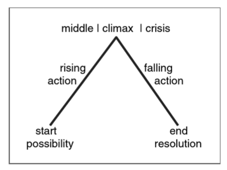
Figure 2.6.a: Gustav’s triangle (Ferster & Shneiderman, 2012, Figure 7.1)
Accessibility
In the field of data visualisation, color, when utilised sensibly, is the most important means by which any visualisation can be improved (Steele, 2010, p. 60). A key use of color is to focus the attention on the essential parts of the visualisation, this can be done with brightness of other non-essential parts as well as the bring out the vividness of essential part to the story (Wang et al., 2008). As seen in Figures 4 and 5, different colors were used and put in legend to differentiate between each nationality. In Figure 4, the timeline from 1950 to 2021 was shown in terms of points scored by each team, since we chose the top 4 countries (who won the most championships), this became too crowded with points and lines overlapping each other too often. To fix this, low opacity was used for countries other than Britain and Germany to highlight the competition between them. In Figure 5, the initial visualization had all the countries with points of drivers from each nationality. This became deceiving as the purpose of the study was to see the rise and fall of British dominance so grey color was used in Figure 5 to focus the attention on only Britain and Germany to compare their drivers as one of them eventually went ahead to lead the sport 2010 onwards. As far as for viewers who are color blind, it can be really difficult for them to distinguish between the colors used and can possibly misinterpret the visualisations. For instance, in Figure 1, the world map shows the number of constructors per country as a color scale. To solve this, color blind applicable colors were used in all the five visualisations (Figures 1 to 5) (Garnier et al., 2021; Color Blind Friendly Color Palette, n.d.). Assorted sizes of the points were also used in Figure 1 so that it would be easier to differentiate the number of constructors between each country. Consequently, the countries with the most constructors were allotted a larger amount of point size than the countries with fewer constructors.
According to Kirk (2019, Chapter 10), firstly, not all continuous scales should start from 0. In our continuous Figure 4, initially, the scale was from 0 to 2021 which was a bad way to represent a timeline since all the events started 1950 onwards. Hence, the scale was modified to start from 1950 to make it easier for the viewers to read since Formula 1 started only after 1950. Secondly, the resolution should be increased to make the Figures legible for both digital interpretation and for print. For instance, in Figures 1, 3 and 4, it can be challenging to make out sense from the graphs because of the low resolution. Thus, for the purposes of our study the resolution was set to 100 dpi instead of the default 75 dpi. Thirdly, the arrangement of the visualisations can be improved through annotations, orientation and labels in a way that can become a part of storytelling. In Figure 4, the x-axis text (nationalities) were overlapping due to lack of horizontal space and was therefore rotated by an angle of 45 degrees so that the nationality names are easily readable and do not overlap with each other. Furthermore, In both Figures 4 and 5, annotations were added to highlight major events occurred over time for constructor’s as well as driver’s championships. This was done to add sense to these visualisations, improve the aesthetics, and most importantly to follow the storytelling path given in Figure 2.6.a i.e. to support the viewers to perceive the significance of the dominance, and highlighted events throughout history.
Visualisation choice
Firstly, for Figure 1 we had a continuous variable (number of constructors) to plot with one categorical variable (country). The possible options for this were bar chart, lollipop chart, instead a geo-spatial visualisation in the form of a combination of proportional symbol map and choropleth map was used to show number of constructors for each country. This was done to support the trend of our story (British dominance) i.e. show Britain’s size against its leading amount of constructors compared to big countries (geographically) like United States of America, Russia, so on and also because the proportional symbol map can accurately show quantitative values for the mapped countries on a map (Kirk, 2019, p. 182).
Next, the grouped scatter chart, heatmap were some possibilities for Figure 2, but they were rejected since they would be difficult to comprehend and will only offer a small amount of information to the viewer. In this case, an inverted stacked bar chart was used in order to show the number of championships won by different constructors and drivers grouped by nationality. According to Indratmo et al. (2018), inverted stacked bar chart is the most efficient choice for attribute comparisons (drivers and constructors championships in this case).
In Figure 3, the number of podium finishes by each team was plotted grouped by nationality. The purpose here was to see which country came on top from 1950-2021 in terms of performance, bar charts, lollipop charts and donut/pie charts were a possibility. For bar/lollipop charts the data was not telling the whole story since the differences between Italian and British drivers was not substantial. In case of donut/pie charts, the complete proportion did not add up to 100%, thus they were rejected. Treemaps were chosen for this figure, since, firstly, precise comparison (in terms of numbers) is not necessary here (Ricks, 2020). Secondly, we want a part to whole evaluation and lastly, the data is hierarchical in this case (Ricks, 2020).
Next, for the time series analysis in figure 4 bar/lollipop chart was not a good choice since the data in our case is high in volume (1950-2021), so the number of bars would make the visualisation complicated for the user. Similarly for area chart, since we are comparing the top four countries (Britain, Germany, Italy and France), the amount of cross-over events would make it difficult to make sense of the visualisation. Hence, line chart was used to show the events throughout 1950-2021 since they work well when showing trend in a dataset over time (Hardin et al., 2012).
Finally, for another time series analysis we had possibilities of all bar/lollipop charts, line charts and area charts. In this case, the time series had a low volume data (2010-2021). Since the number of countries were 10, line chart was not feasible. This was because ten lines would make the visualisation too overwhelming for the viewer to comprehend. Similarly, it would difficult for the user to distinguish between ten areas in the area chart. Hance, bar/lollipop chart would be the ideal visualisation for this case. Furthermore, to improve the storytelling part of our visualisation, annotations were also added in Figure 5. Because of this the traditional bar charts became too overwhelming for the viewers due to the width of the bars and additional ink in the chart. To fix this, lollipop variation of the bar chart was used to accommodate for more space for the annotations (Evergreen, 2016, p. 222).
Implications and Improvements
Data driven visualisation and journalism for sports such as Formula 1 has gained some recognition in the recent years (Işıl Vural & Masip, 2021). The visualisations provides insights on stories which are latent in an area such as motorsport where action and entertainment is prioritised before information and facts. The dark side of these visualisations is that they are always only partially true. This is because these do not account for data which should be collected in the off time i.e. off-track implications of Formula 1. In the era of Germany’s Mercedes’ domination in Formula 1, there were many off-track politics issues which were bigger than the sports itself (Garside, 2020). This could potentially be responsible for the performance on track but with no way to measure this in the visualisation: the missing part of the storytelling will always exist.
The visualisation in this study could also misinform the viewers due to some ethical implications and ambiguity in Formula 1 geographical structure. In the dataset used in this study as well as the global sport community itself, Mercedes is considered to be a German team due to its corporate headquarters being located in Stuttgart, Germany (Wikipedia contributors, 2001). Although in reality, the Mercedes Formula 1 team is located in Britain (By The Newsroom, 2018). Moreover, the team is led by a British driver i.e. Lewis Hamilton. This makes the study ambiguous and can misinform the viewers of German dominance when all the factories, headquarters and drivers originate from Britain.
As with all the datasets and visualisations, as can be seen from the ones used in this study, improvements can be found in order to better illustrate the story. Firstly, the dataset can include all the records achieved by both teams and drivers to better see the dominance of any individual. Secondly, winning percentage could be calculated to see the performance metric instead of wins as shown in Figures 2 and 3. Thirdly, from being awarded 8 points per win in 1950 to 25 points per win in 2021 the points system in Formula 1 has gone through many changes and this was not considered in this study due to lack of resources (Collantine, 2021). Lastly, the dataset did not contain any information about each constructor’s engine, which could have been used to compare performance in terms of reliability, aerodynamics and even to compare the evolution over time in terms of design (Jenkins et al., 2016). With these improvements, we would be able to better analyse whether the Formula 1 is biased towards one nationality in terms of performance, equipment, and will even be able to consider off-track events with time- series analysis for each decade.
